Katikai
Introduction
Katikai is a newly established school lunch service based in Katikati, delivering fresh, made-to-order meals directly to classrooms at Katikati Primary School.
Built on the idea of convenience for busy parents and nourishing food for growing kids, the service had all the right intentions — but the brand wasn’t making it easy for people to engage.
The opportunity was to simplify, energise, and create something that felt instantly recognisable; bringing clarity to parents, while making it genuinely exciting for kids to be part of.
The Story
At its core, Katikai exists to make everyday life easier.
For parents, it’s a no-fuss way to ensure their kids are well-fed during busy school days. For children, it’s something to look forward to. A small moment of joy delivered straight to the classroom.
The original brand, built in a DIY phase, was struggling to communicate that. Messaging was text-heavy, visually overwhelming, and difficult to navigate — especially within a diverse, multi-cultural school community where clarity and ease are essential.
The shift was simple in principle: strip everything back to what matters most, and rebuild it in a way that feels clear, engaging, and full of life.
Stripping back + turning up
The approach centred on two key moves.
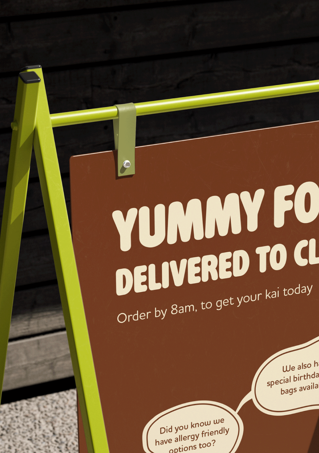
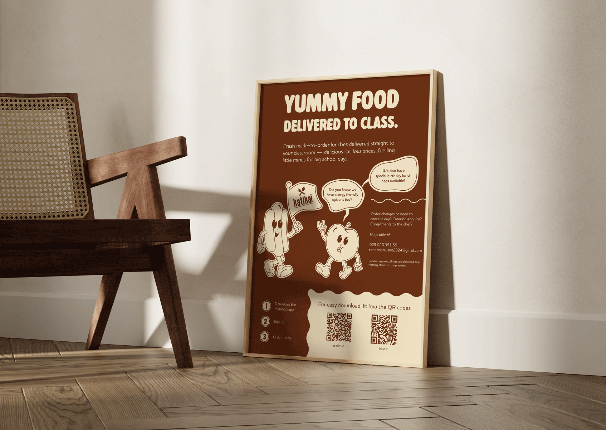
First, everything was simplified. A tight two-colour palette replaced the visual noise, and information was reduced to a clear, step-by-step system — making it easy for parents to understand exactly how the service works at a glance.
At the same time, the brand was dialled up in all the right places. Personality, playfulness, and energy were brought forward, transforming Katikai into something kids would recognise, remember, and feel drawn to.
It’s a balance of clarity and character: functional for parents, fun for kids.
Design Elements
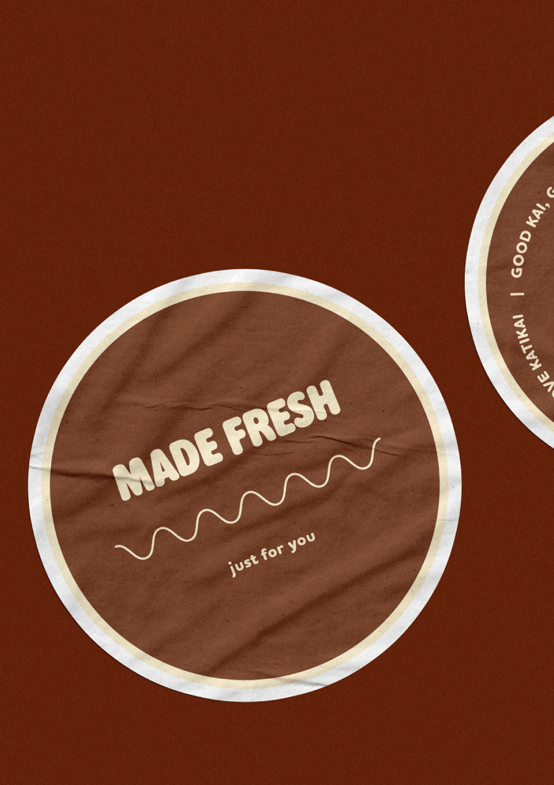
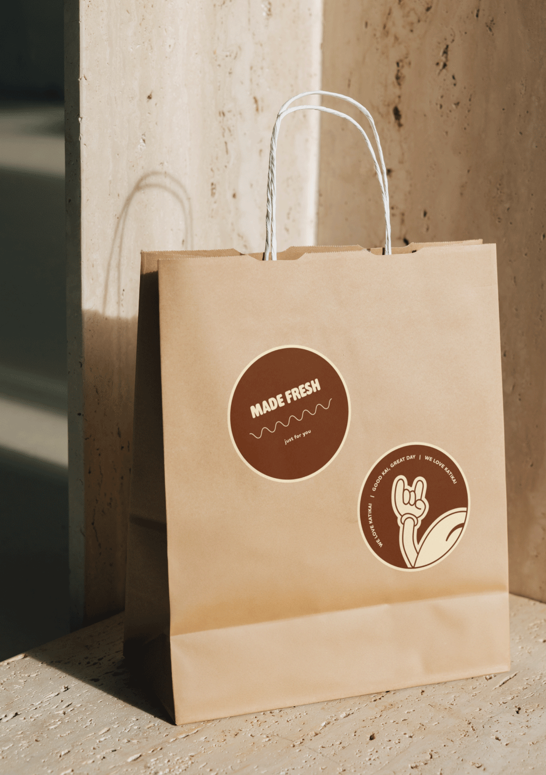
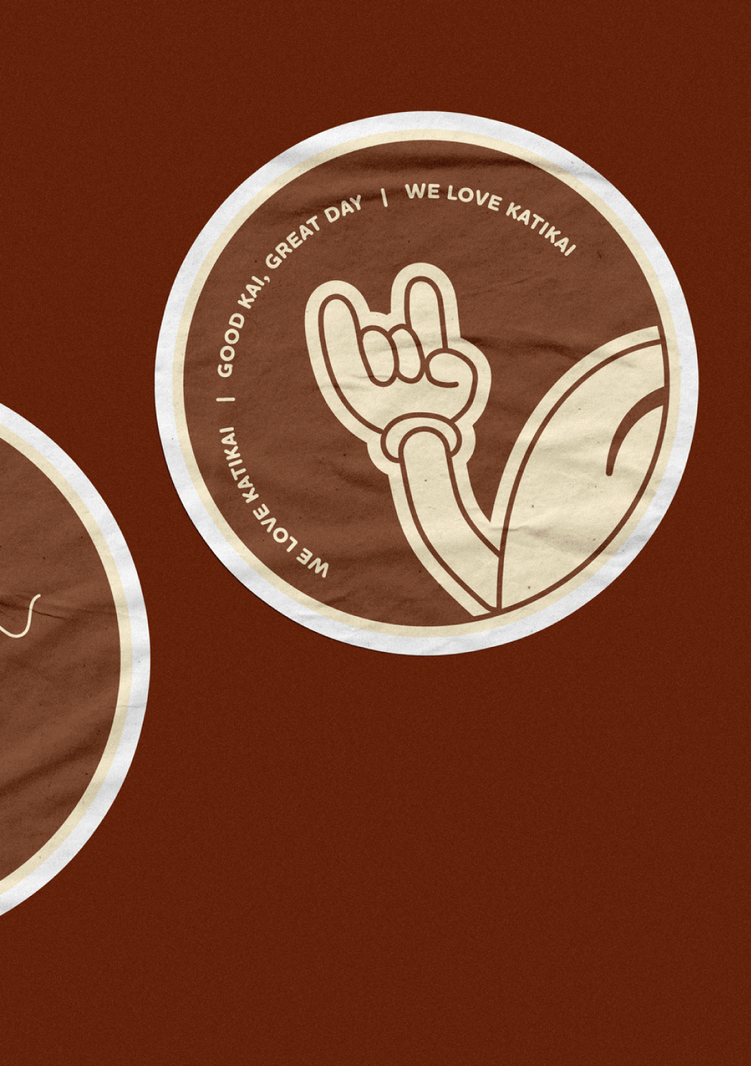
Bold, Simplified Colour Palette
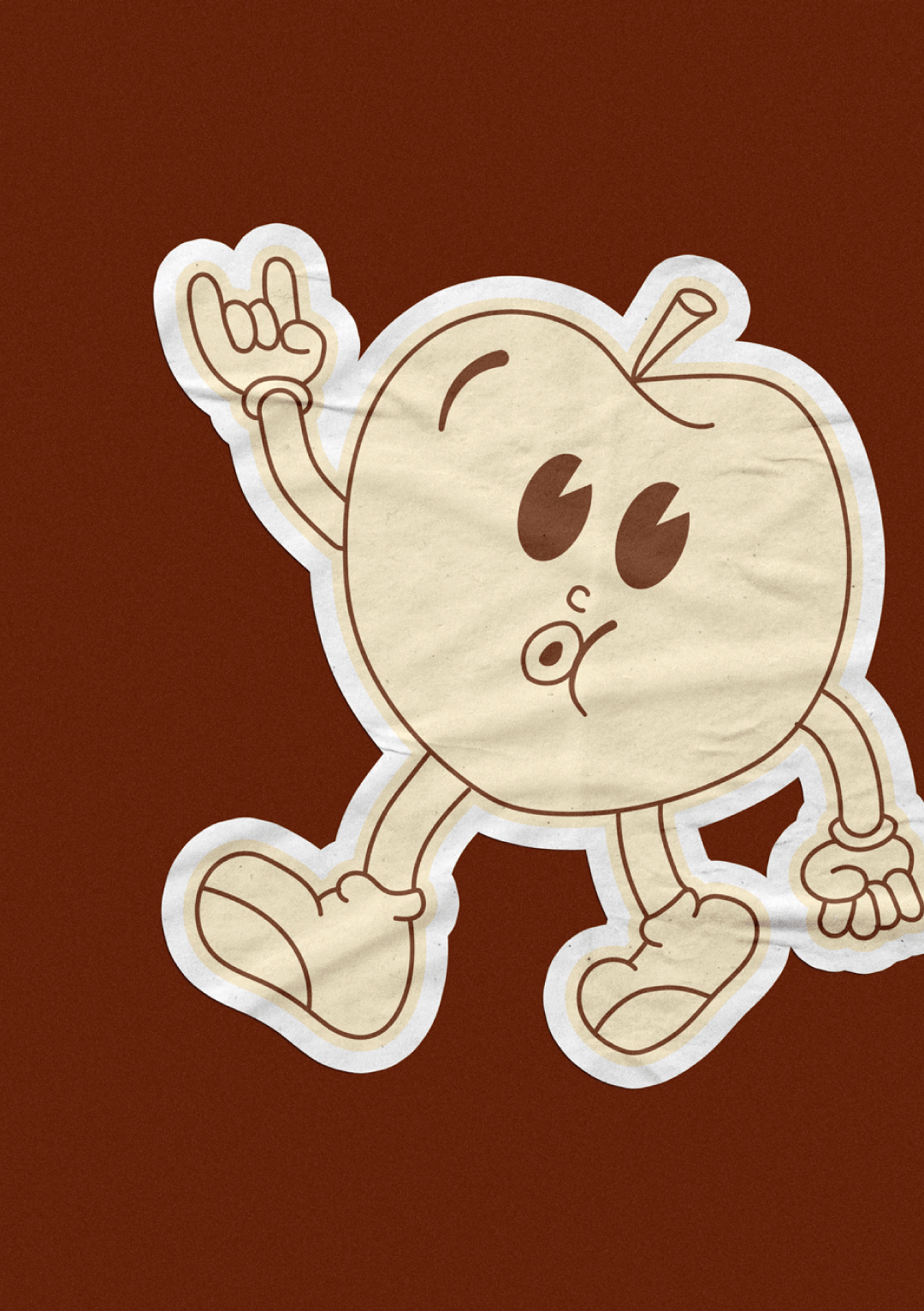
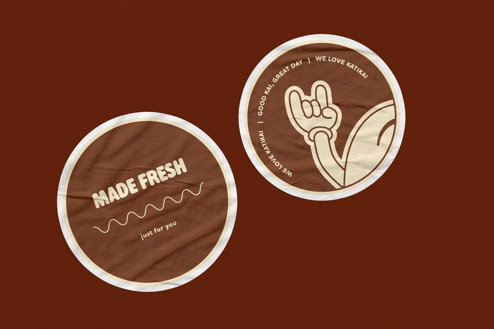
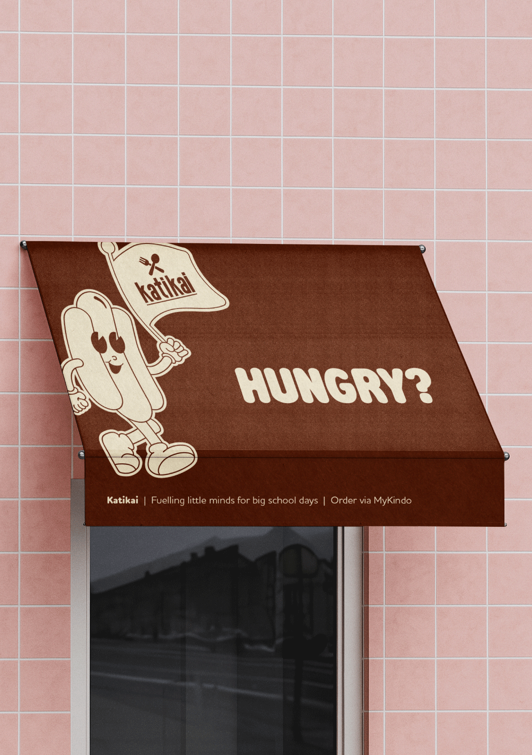
A rich, chocolate-toned palette cuts through the sea of bright, inconsistent school signage. Limiting the scheme to two colours creates instant recognition while keeping the overall feel warm, grounded, and appetising.
Playful, Considered Typography
A rounded serif typeface brings a sense of friendliness and approachability, while remaining highly legible. The focus is always on clarity, ensuring key information is easy to read quickly, even in busy school environments.
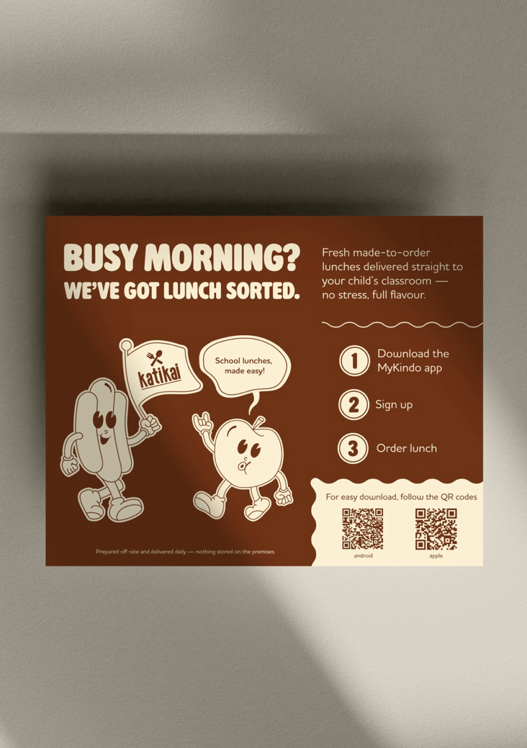
Clear, No-Brainer Layouts
Large headings and a simple 1–2–3 step system guide parents through the process with ease. The layout removes friction, turning what could feel like effort into something straightforward and accessible.
Character-Led Identity
A set of mascot characters, a hotdog and an apple, bring the brand to life. Playful and full of personality, they act as visual anchors across signage and posters, helping kids recognise the service and making the brand feel safe, familiar, and fun.
Key Benefits
Clear and Easy to Engage With
Parents can quickly understand how the service works, removing confusion and lowering the barrier to ordering.
Instant Recognition
The simplified palette and bold characters make Katikai stand out in a visually busy school environment.
Appeal Across Audiences
The brand speaks to both decision-makers and end users —balancing practicality for parents with excitement for kids.
A Joyful, Memorable Identity
The character-led approach injects warmth and personality, turning a functional service into something people genuinely enjoy interacting with.