Iolite BEauty
Introduction –
Iolite Beauty, based in Katikati, New Zealand, is more than just a beauty salon—it’s a sanctuary. Founded by Sarah, the salon is designed to offer clients moments of stillness, care, and connection. Every detail of the brand reflects her vision: creating soulful experiences that nurture from the inside out.
The Story –
Inspired by the calming properties of the iolite crystal, the branding for Iolite Beauty embodies clarity, self-reflection, and balance.
At the heart of the visual identity are hands—Sarah’s own hands—symbolising her personal touch and the deeply human connection she brings to every treatment. This gesture reinforces the idea that clients are quite literally “in safe hands” when they visit.
The brand encourages clients to slow down, breathe deeply, and savour the experience of true self-care.

Self-care with soul –
The tagline, “Self-Care with Soul”, speaks to Sarah’s philosophy of beauty as more than surface deep.
Each treatment is an opportunity to pause, reconnect, and restore. This soulful approach ensures that every client leaves not just refreshed on the outside, but nourished on the inside.

Design Elements –
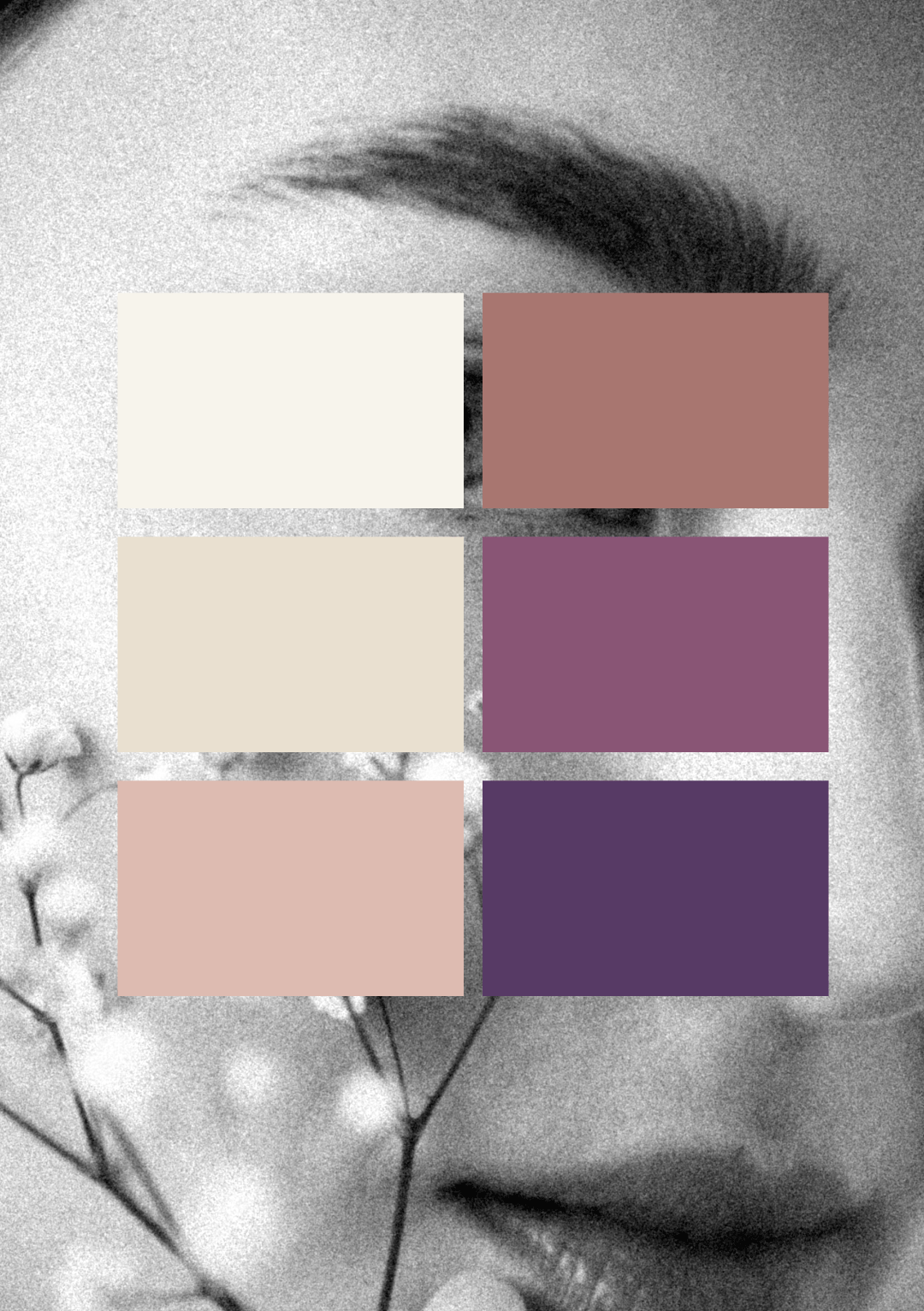
Soft, Feminine Colour Palette
Gentle shades inspired by the iolite crystal convey calmness, balance, and serenity—perfectly suited to the brand’s intention of creating a restorative escape.
Illustrative Design Style
Delicate illustrations bring warmth and a handcrafted feel, adding a personal and approachable dimension to the brand identity.
Clean Sans Serif Typeface
The primary logo uses a contemporary, clean sans serif font, ensuring clarity and professionalism.
Beautiful Script Accent
The tagline is expressed in a flowing script, adding elegance and softness, while echoing the fluidity of Sarah’s hands-on care.
Key Benefits –
A Soulful Sanctuary
Ioliyte Beauty offers more than beauty treatments—it’s an experience of slowing down, reconnecting, and being cared for.
Personal Connection
With iconography featuring Sarah’s own hands, the brand reinforces the authenticity and personal touch that clients can expect.
Timeless Elegance
The combination of soft colours, delicate illustration, and refined typography ensures a brand that feels both modern and enduring.