NEstlings
Introduction
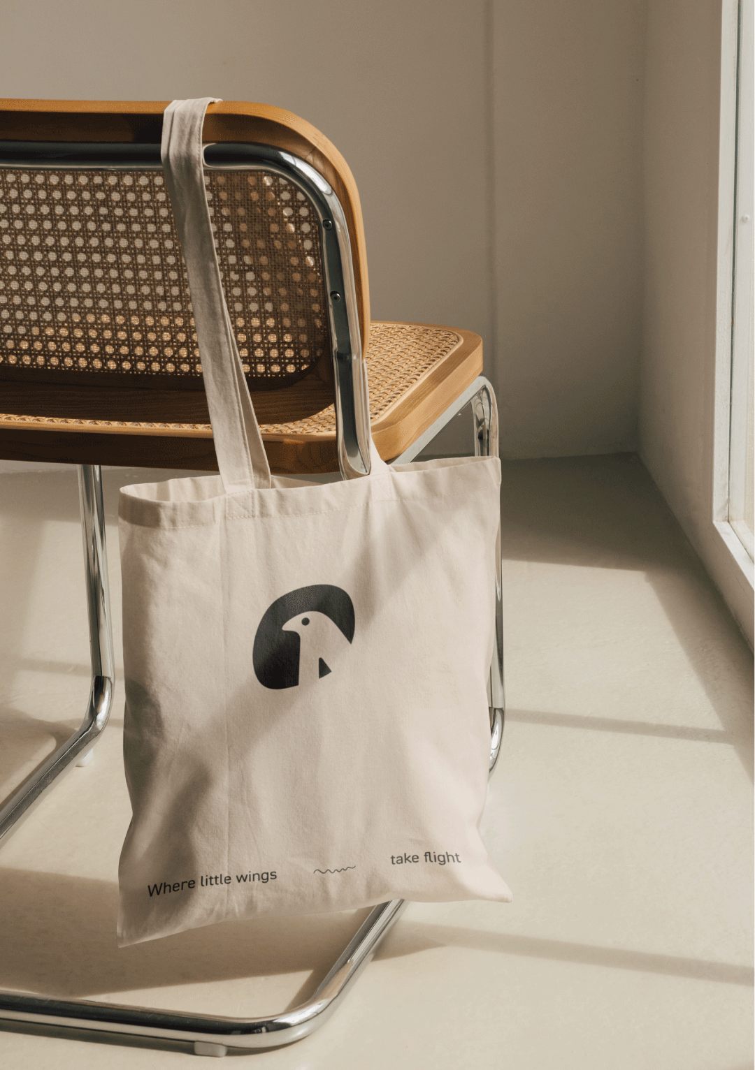
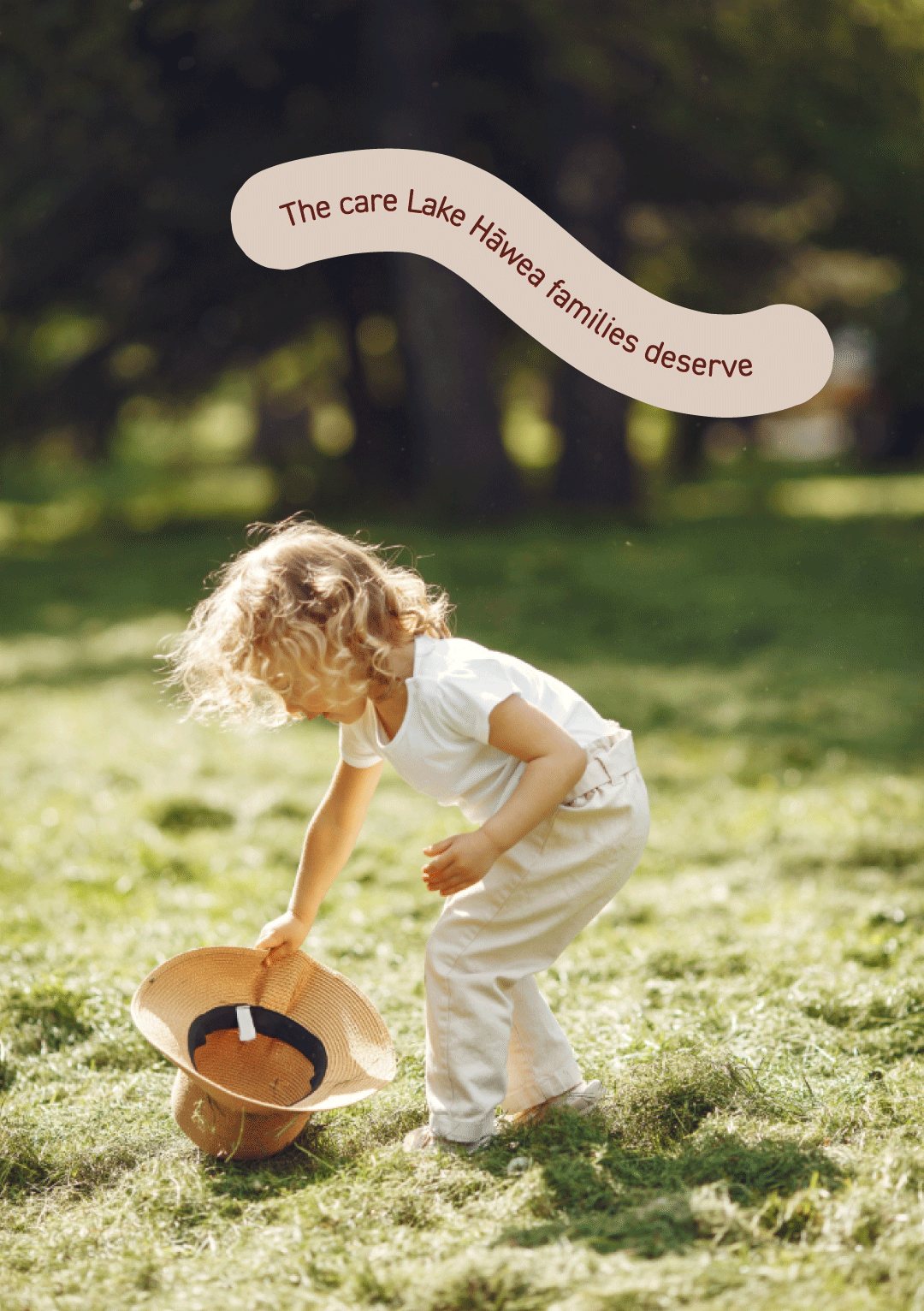
Nestlings is a Lake Hāwea early learning centre, in new hands. The kind of hands that are determined to make this place something special.
Formerly known as Kānuka Corner, the centre wasn't after a slogan or a big announcement. It wanted a brand that felt different the moment you walked through the gate.
New owners, new passion, a whole new standard of care. The brief wasn't "make us look nice." It was "make people feel it."
The Story
The thing about trust is – you can't buy it. You can't announce it, and you definitely can't slap it on a banner out the front and expect people to believe you.
It has to be earned, one small moment at a time — the way a place looks, sounds, and makes you feel the second you step inside.
The new team at Nestlings knew exactly what they wanted people to feel: cared for, welcomed, like their child mattered to someone.
What they very deliberately didn't want to do, was stand at the gate with a megaphone shouting "WE'VE CHANGED, WE PROMISE." Because nobody trusts the loud guy with the megaphone. People trust the place that just... quietly gets it right.
So before a single colour swatch came out, we did something a bit nosy: we had a good look at every other early learning centre in the surrounding area. Not to copy them, but to spot the herd, so Nestlings could walk in the opposite direction.
Reading the room (and then leaving it)
Turns out, early learning centres in this part of the world have a type. Soft pastels. A leaf or two in the logo. The words "nurturing" and "down-to-earth" doing a lot of heavy lifting, on repeat.
Lovely sentiment. Zero memorability.
That sameness was the gift. If everyone else was whispering "we care" in beige, Nestlings could say it in full colour — and actually be heard.
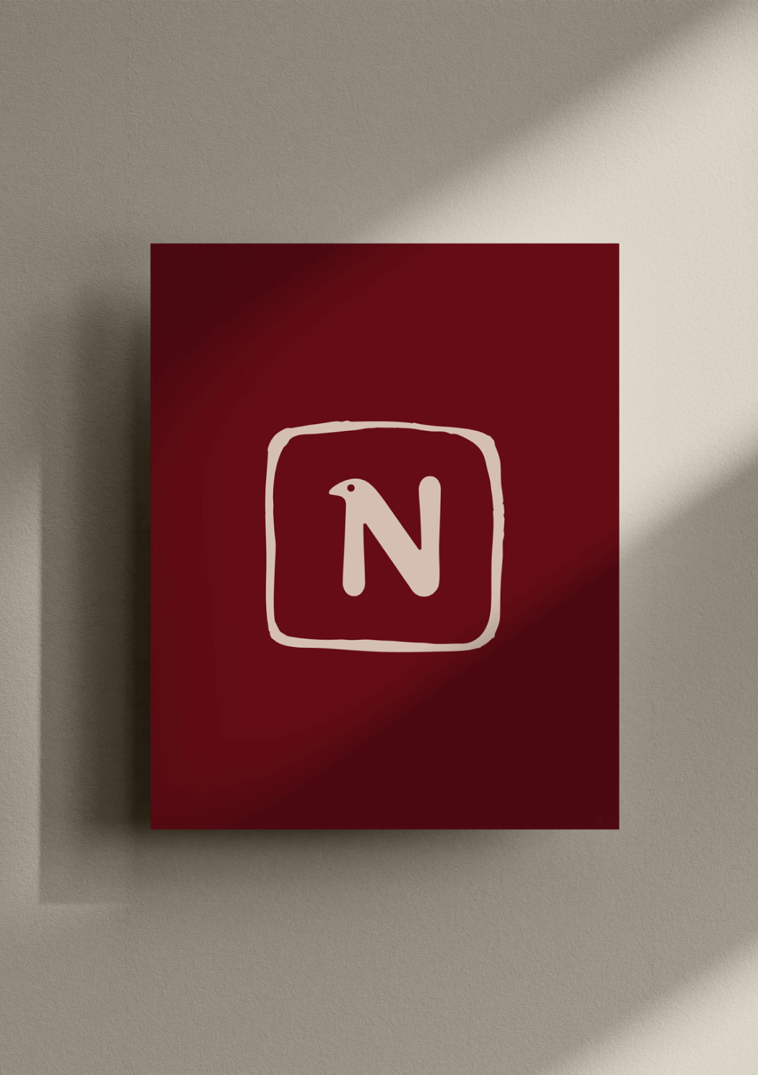
So we went bold instead of muted. Deep, confident reds instead of the expected sage-and-sand palette. Language with actual warmth in it. Playful, but never chaotic. Premium, but never cold. A brand that feels like new hands are on deck — without a single line of copy needing to say so.
The Transformation
A Bold, Unexpected Palette
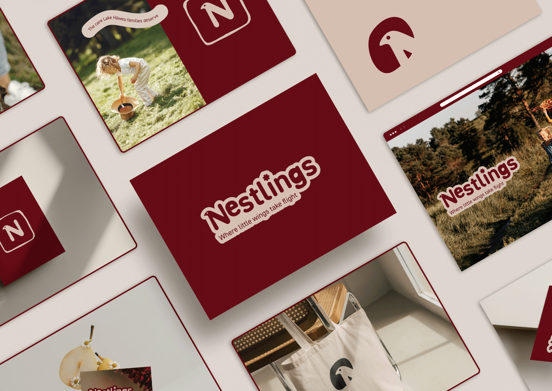
Deep burgundy, and warm sand step in where soft green and pastel usually live. In a sea of muted "friendly preschool" branding, it's the one that actually gets noticed — and remembered.
A Voice With Heart, Not Buzzwords
Instead of leaning on the same "nurturing, down-to-earth" language every centre nearby was already using, Nestlings speaks with warmth that feels personal — not pulled from the same template as everyone else.
Quiet Confidence, Not a Loud Announcement
The brand never says "new owners" or "we've changed." It doesn't have to. Families feel the shift the moment they walk in — and trust it more because they arrived at that conclusion themselves.
Built to Stand Out, Not Blend In
Every design decision was tested against one question: does this look like the centre down the road? If yes, back to the drawing board.
Key Benefits
A Fresh Start, Felt Not Told
The new brand gives families every reason to take a second look — and to feel, rather than be told, that something real has changed for the better.
Instantly Distinctive
In a landscape of similarly structured, nature-led branding, Nestlings leans into a different design style stand out. It’s brave, bold and smiling from it’s own highway as they drive forward into new ownership.
Trust Built the Real Way
By letting the brand do the talking instead of the marketing, Nestlings earns trust the way trust actually works — quietly, and over time.
A Centre People Choose, Not Settle For
The transformation turns Nestlings into a place families are genuinely proud to be part of — not just the closest option on the map.