BTw Property Maintenance

Introduction
Meet BTW Property Maintenance — a husband-and-wife duo in Western Australia on a mission to keep homes and properties looking their absolute best. They wanted a brand that reflected their approachable, family-owned nature, while standing apart from the corporate “tradie” look often seen in their industry.
The Story
BTW Property Maintenance offers something rare in their field — genuine warmth, care, and reliability. They take pride in treating each home like their own, bringing integrity and attention to detail into every project. The goal was to create a brand identity that captured that same sense of trust and comfort — one that felt like welcoming hands coming into your home to help, rather than just another service provider.
From concept to creation
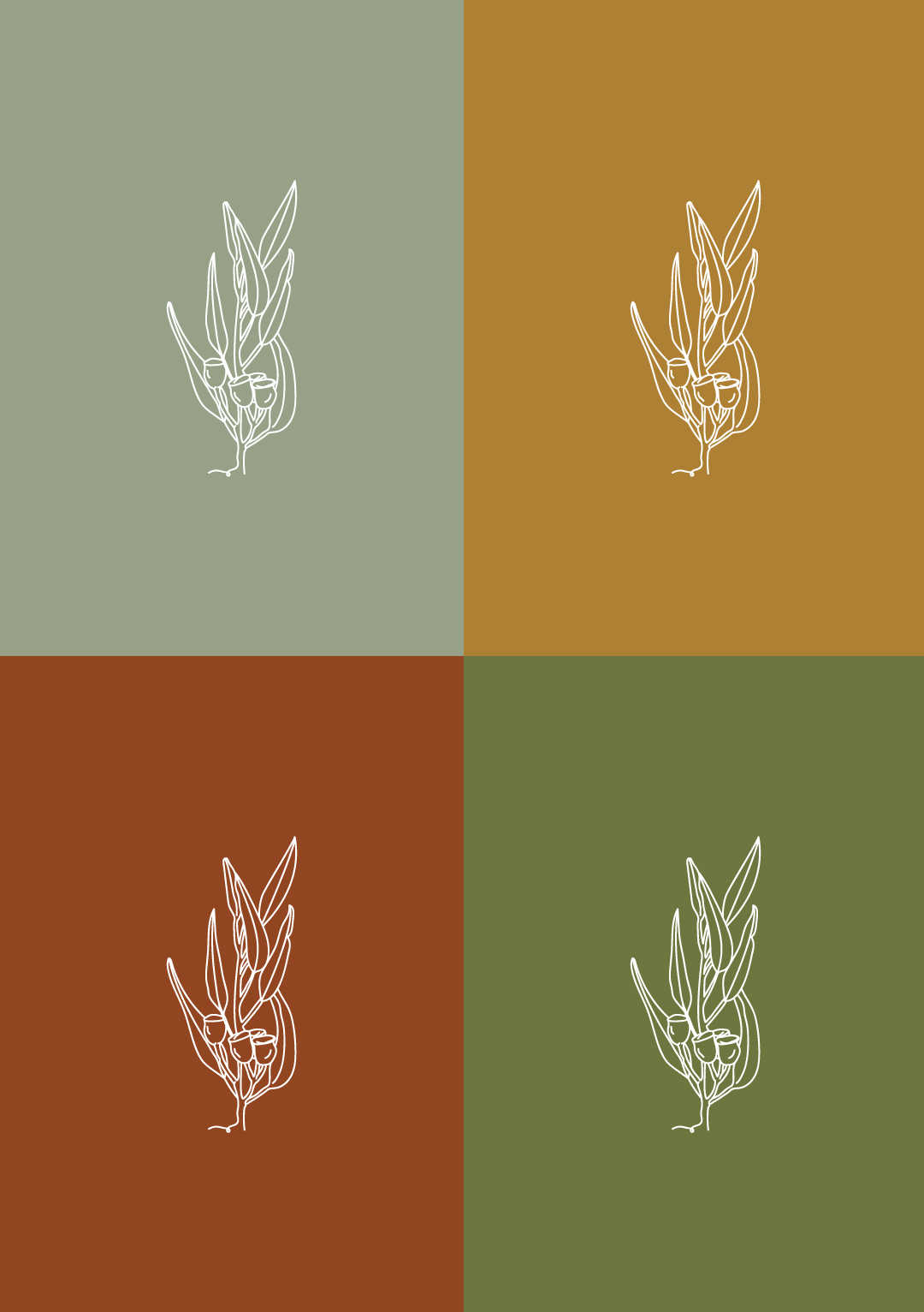
The visual identity draws inspiration from the Western Australian landscape — earthy tones and natural textures. The logo features a custom-illustrated native gumtree, a nod to their local roots and the connection between home, land, and care.
Balancing masculine and feminine qualities was key. The soft, organic illustration style brings approachability and warmth, while strong serif typography adds grounding and professionalism. The result is a brand that feels trustworthy, warm, and distinctly local.

Design Elements
Custom Illustration
Gumtree illustration inspired local natives, symbolising care, grounding, and connection to place.
Local-inspired palette
Earthy, nature-inspired palette echoing the tones of the WA landscape — warm, grounded, and distinctly local.
Typography
Refined serif type paired with organic illustration for a perfect balance of strength and softness.
Applications
Complete suite including logo system, icons, colour palette, and social assets.
Key Benefits
Credible & Approachable
The new identity helped BTW stand out as professional yet family-oriented — approachable, warm, and trustworthy from the very first impression.
Balanced & Thoughtful
A considered blend of strong typography and soft illustration achieved harmony between masculine and feminine tones, appealing to a broad homeowner audience.
Flexible for Growth
A fully adaptable branding system gives BTW the freedom to scale — with logos, icons, and assets ready for signage, uniforms, and social media.
Recognised & Respected
The rebrand elevated BTW’s reputation, positioning them as serious local contenders in Perth and helping them gain visibility and credibility in their field.


