Common Ground
Introduction
Common Ground is a much-loved local café in Katikati, recently taken over by new owners with fresh energy and a deep respect for what came before.
With a loyal, long-standing clientele at its heart, the challenge was to evolve the brand in a way that felt familiar and welcoming —while gently inviting a new generation of patrons through the door.
The result is a brand that feels grounded and wholesome, full of smiles, friendly faces, and food made to be savoured.
The Story
At its core, Common Ground is exactly that — a shared space. A place where generations overlap, conversations flow easily, and everyone feels comfortable pulling up a chair.
It’s not about trends or hype, but about connection, consistency, and showing up with care, day after day.
Honouring history
The name Common Ground is part of the café’s history — well known and fondly held by the Katikati community. Rather than rewriting that story, the new owners chose to honour it.
Their focus was on bringing the business forward with fresh eyes and renewed passion, while protecting the warmth and trust that regular customers had built over time.
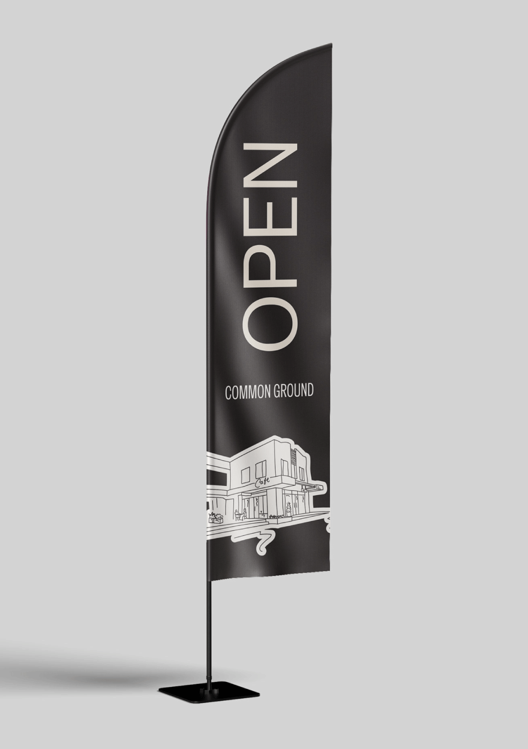
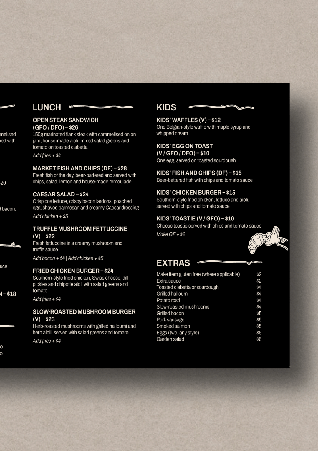
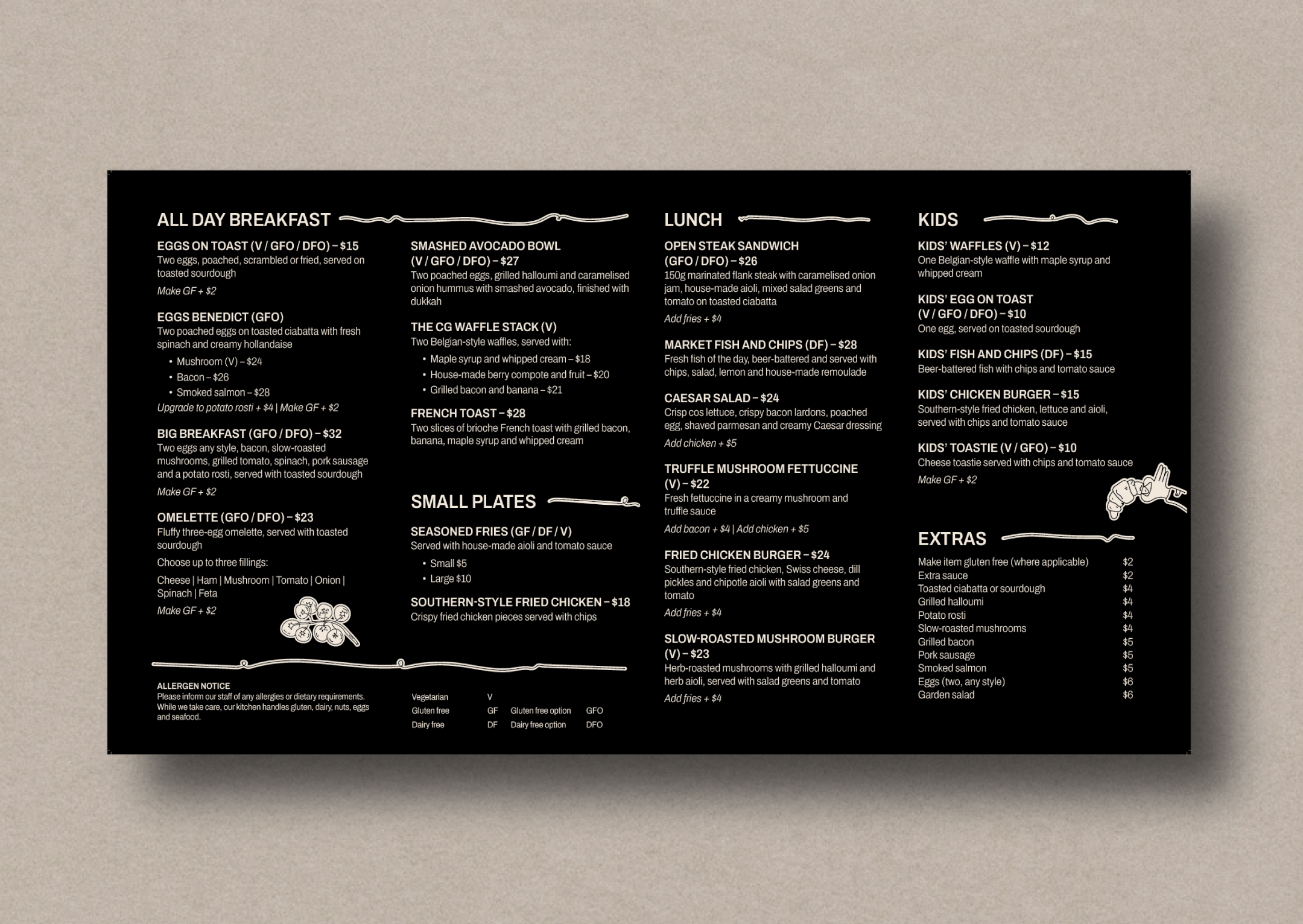
This meant updating the brand touchpoints — menus, signage, and collateral — to feel considered, contemporary, and inviting, without ever feeling like a departure from what people loved.
It’s a careful balance of past and present: familiar enough to feel like home, refreshed enough to feel exciting.
Design Elements
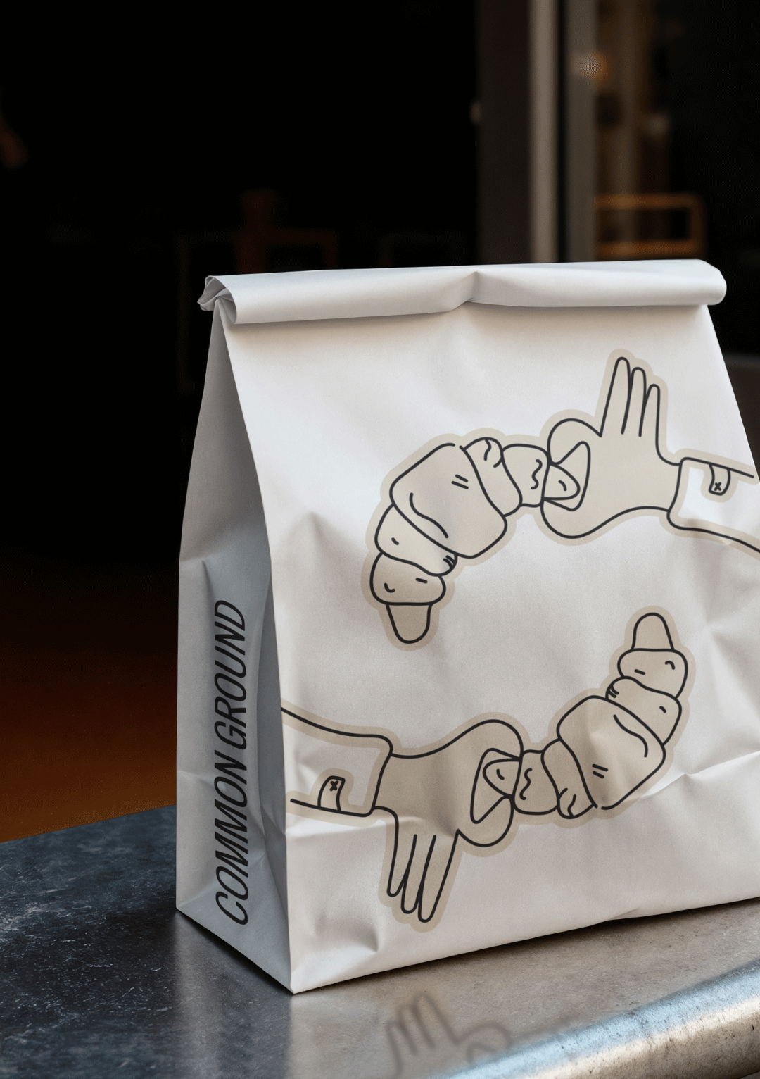
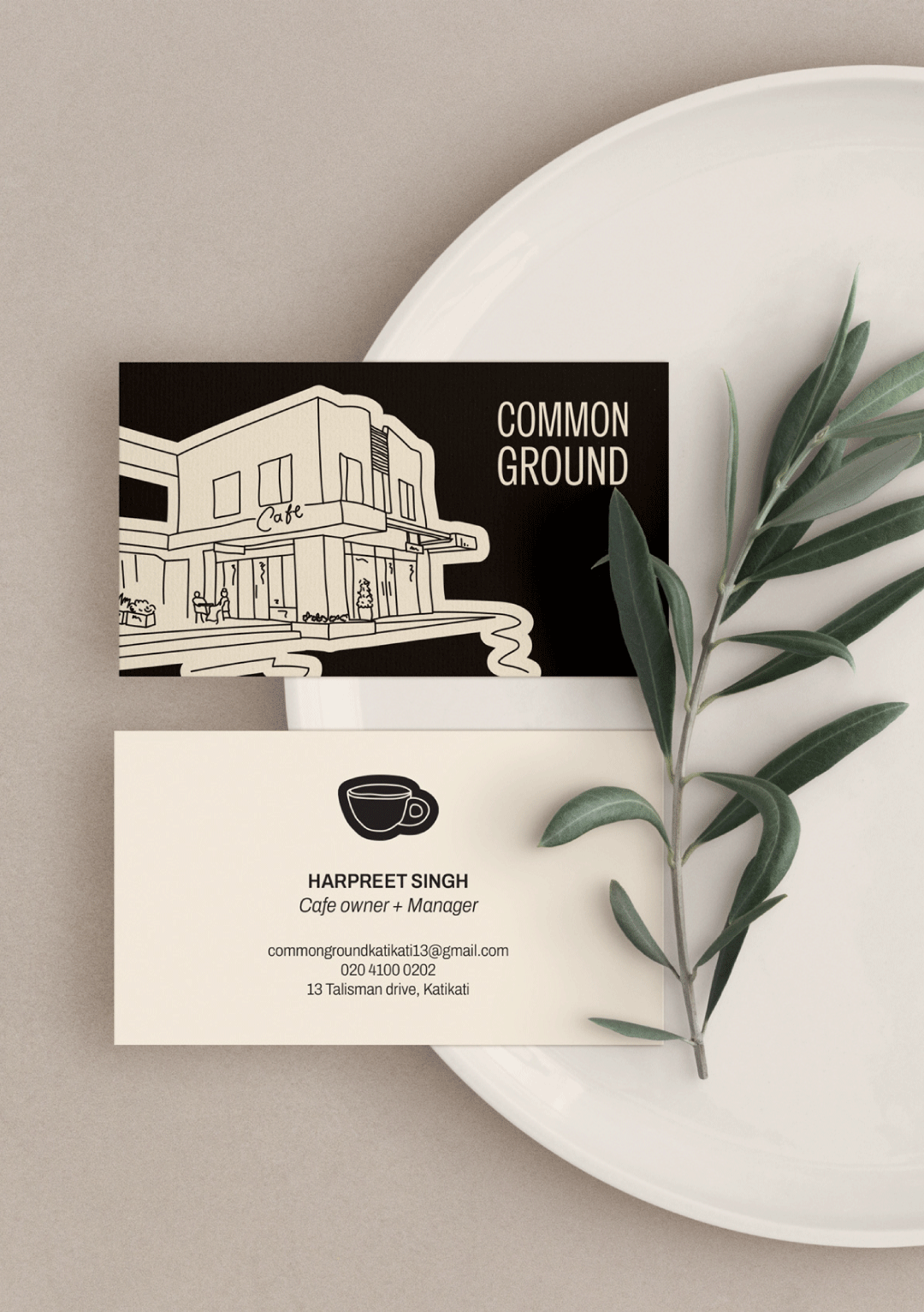
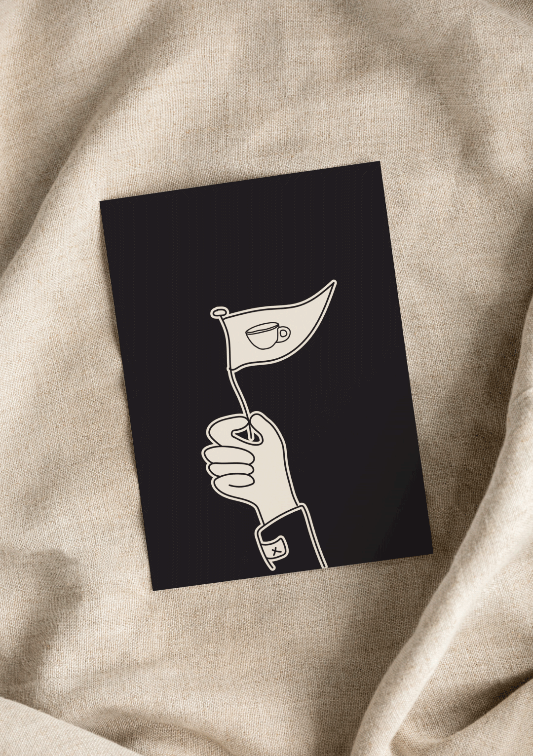
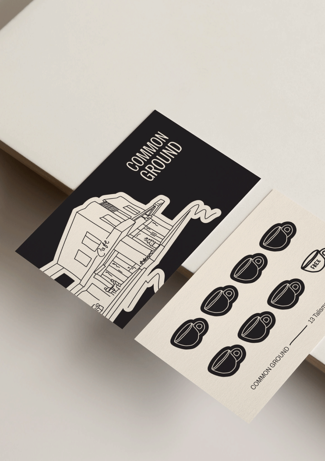
Soft, Grounded Colour Palette
Sandy beige paired with off-black softens the café’s former stark black-and-white branding, creating a warmer, more tactile feel while retaining clarity and confidence.
Calm, Considered Typography
Typography was chosen to be highly readable and approachable—supporting older clientele, while still feeling contemporary and refined for new patrons.
Sensory-Led Visual Direction
The brand leans into feeling rather than flash: the smell of good coffee on a rainy day, the comfort of familiar surroundings, and the promise of delicious food with depth and heart.
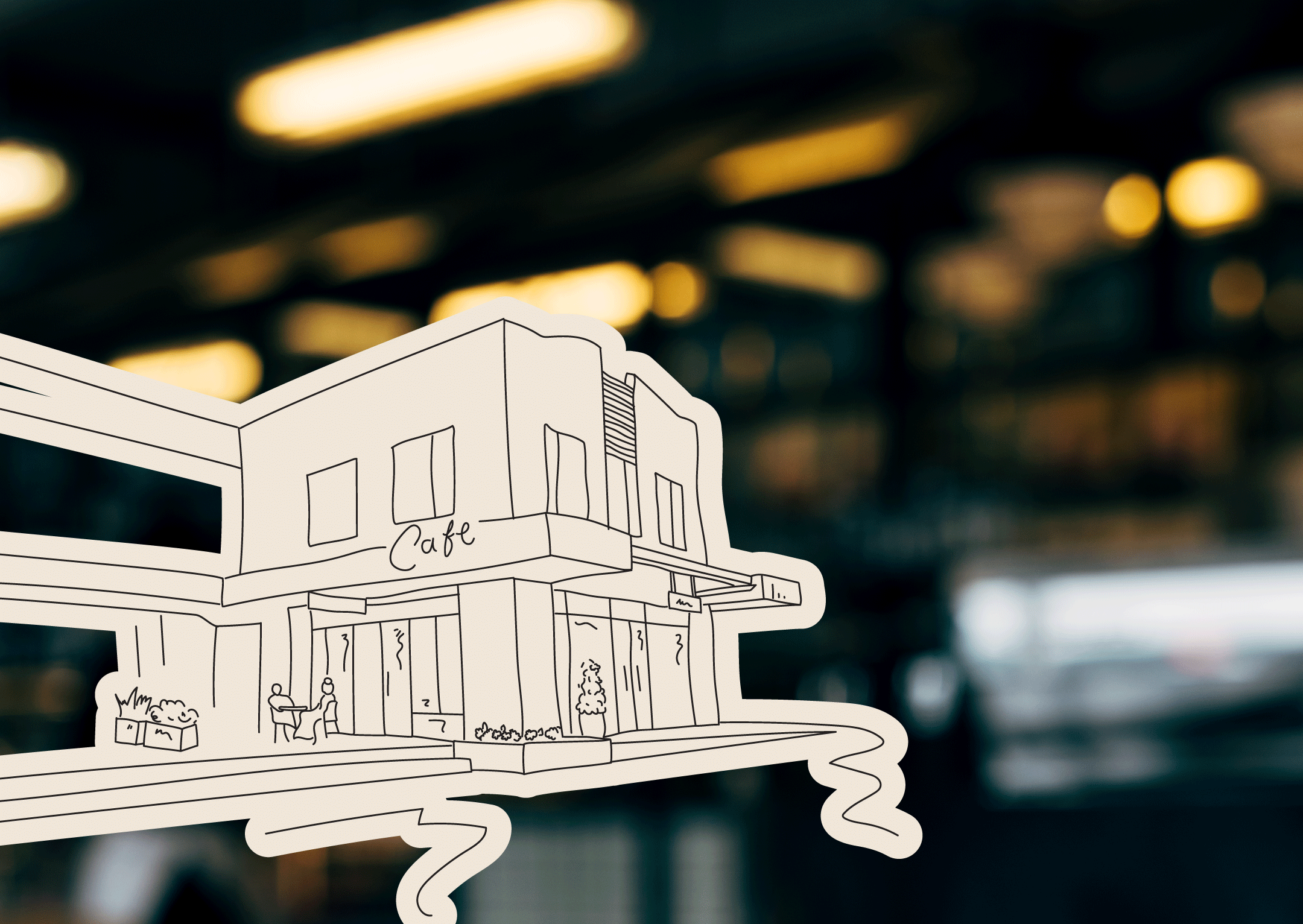
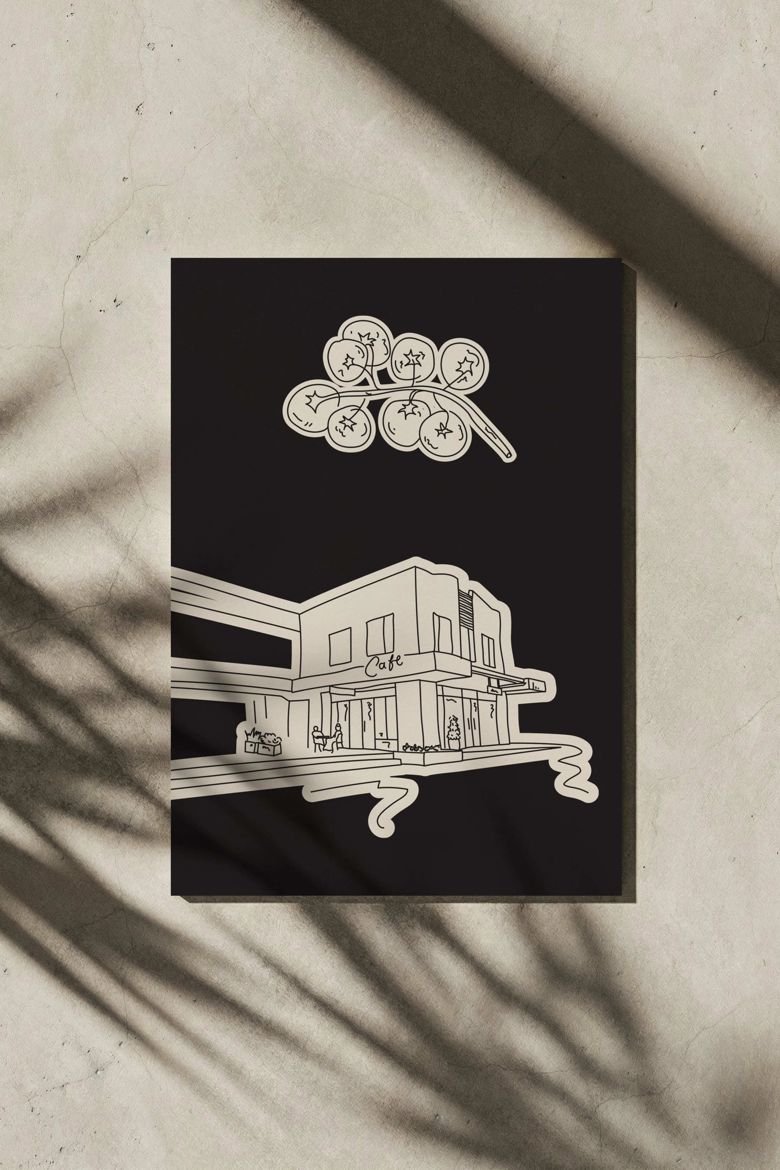
Illustrative Details
A hand-drawn illustration of the café, created from an on-site photograph, anchors the brand firmly in place. Its softened line work reflects the warmth and honesty of Common Ground —recognisable, welcoming, and deeply local.
Key Benefits
Familiar, Yet Fresh
Long-time customers still recognise the café they love, while subtle updates make the space feel renewed and alive.
Welcoming Across Generations
The brand bridges age groups effortlessly, creating a place where everyone feels at ease.
Warm, Grounded Identity
Every touchpoint reflects the café’s true nature — soft, artful, and deeply human. Letting the food and the experience speak for itself.