Māia
Introduction
Māia is a period wear brand for kōtiro (girls) girls aged 8 to 14, created by a mum who spotted a gap and refused to leave it empty.
The product is made for the kōtiro. The education behind it is for the person buying it. Most brands pick one. Māia needed both, without either feeling like an afterthought.
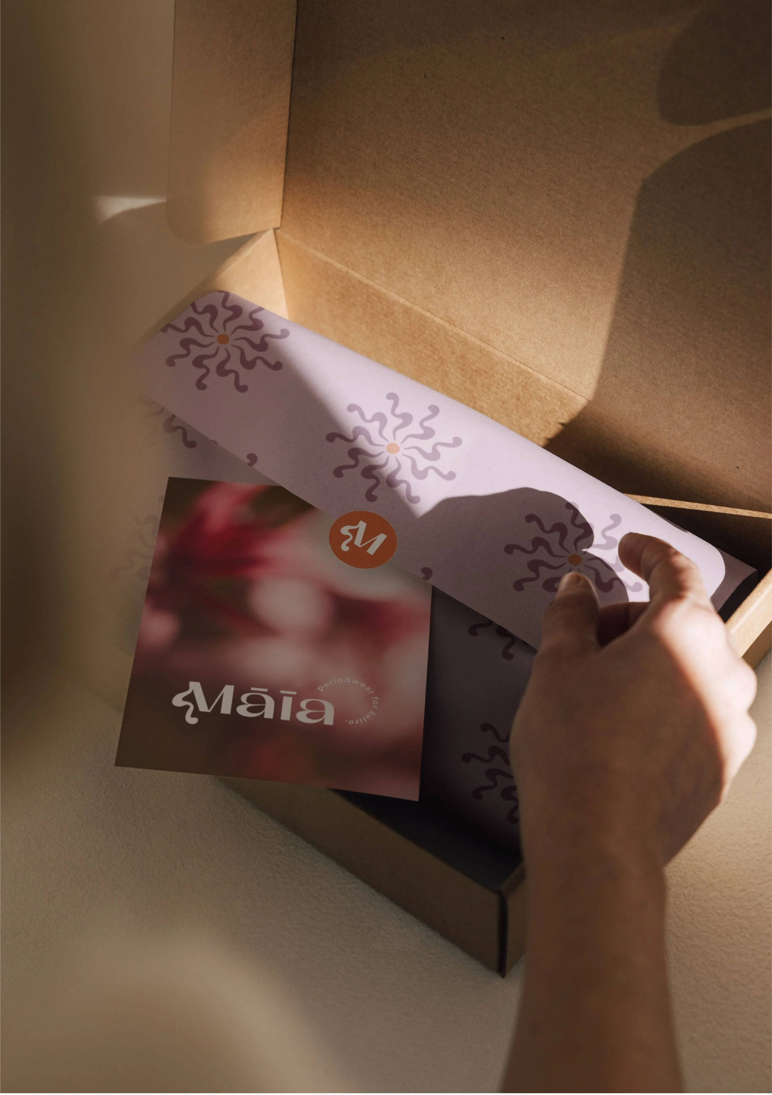
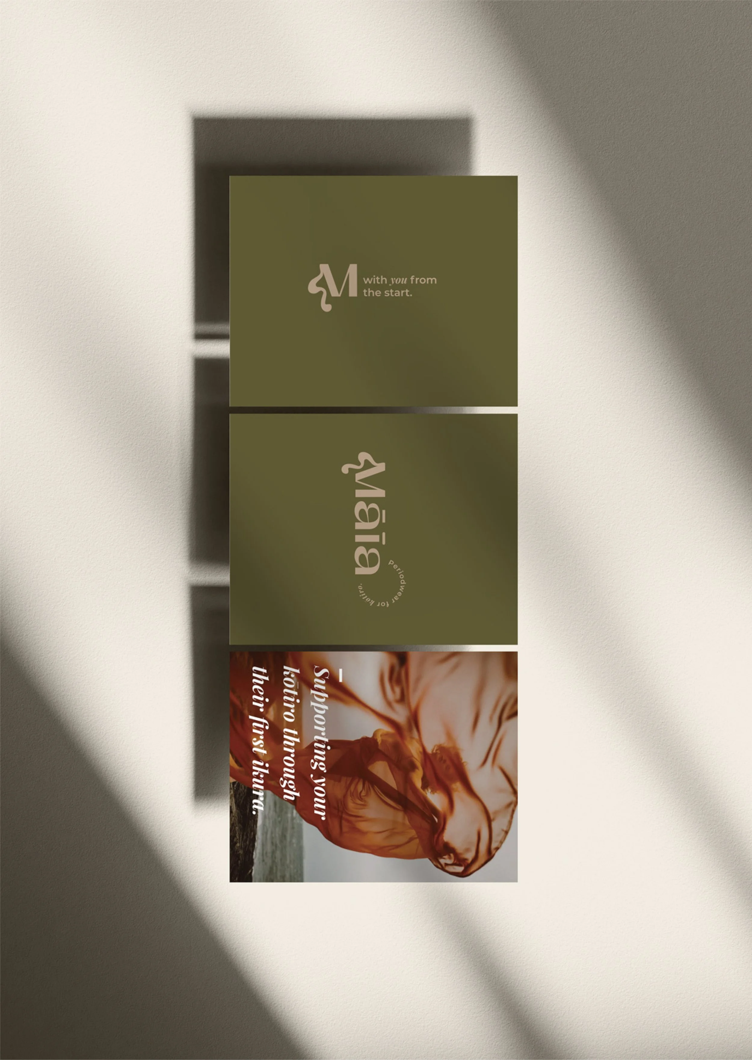
The brief was to build one cohesive brand that could talk to a ten-year-old and her caregiver, then hold together on a swing tag, a welcome card and a screen.
The Story
For a lot of families, the conversation about first ikura (periods) is the one nobody knows how to start.
Caregivers want to get it right. Girls want to be told the truth without it being weird. And the products on the shelf tend to ignore one of them. They’re either clinical and adult, or loud and youth-coded and not much help to the person who has to explain it.
Māia sits in that gap. The product gives girls something made for them. The education gives caregivers something to hold onto when the words won’t come.
That meant the brand had to do two jobs at once. It had to be fun for the girl and trustworthy for the adult. One without the other would have meant half a brand.
One brand, two audiences
The approach was to give each audience its own feel and make sure they never felt like different brands.
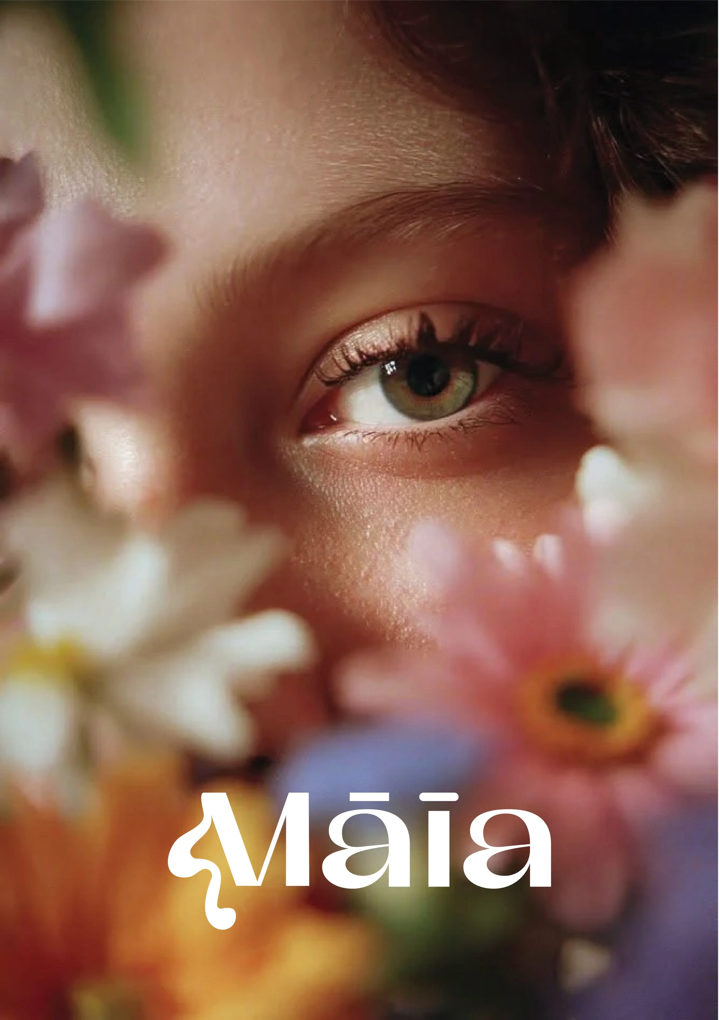
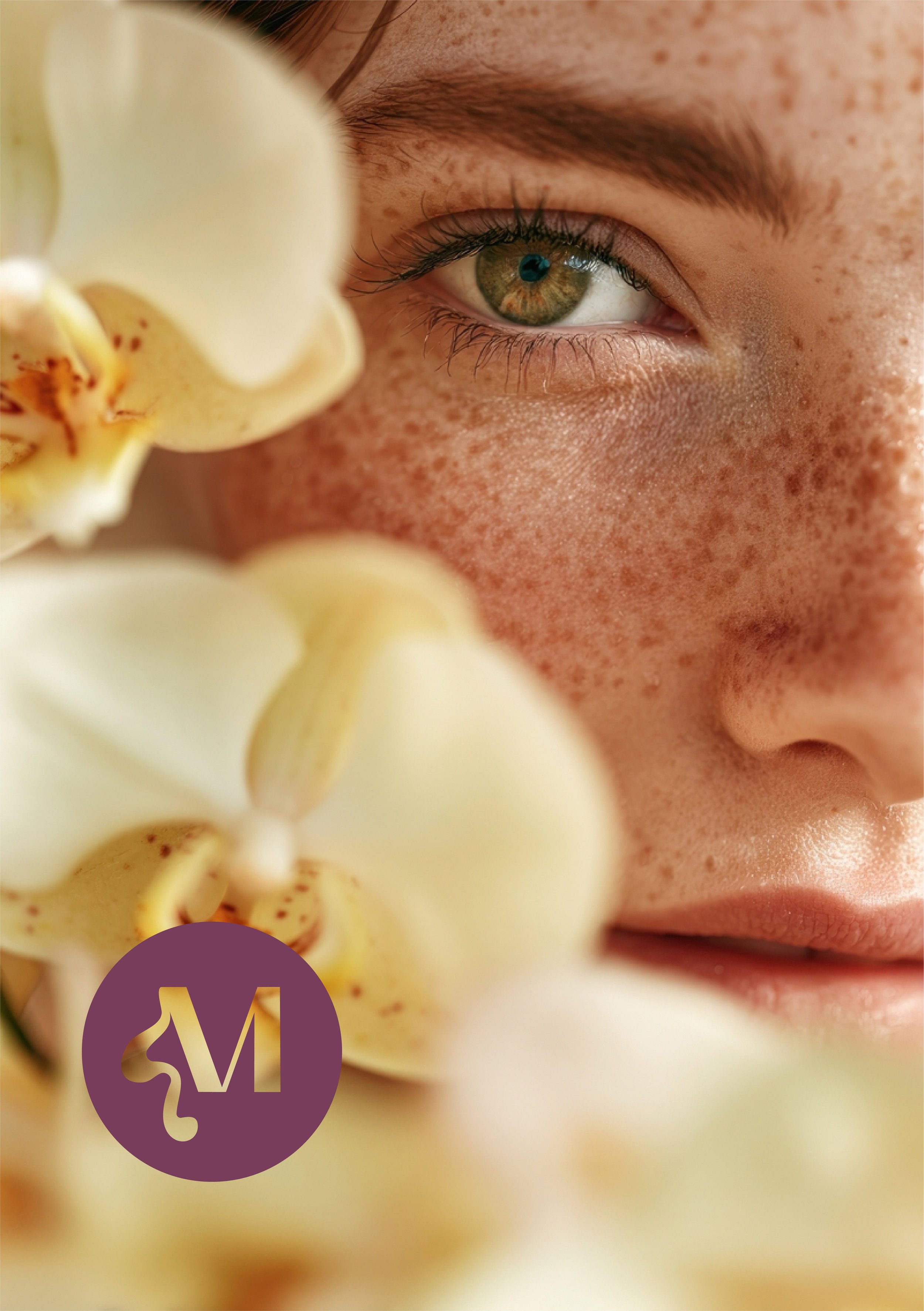
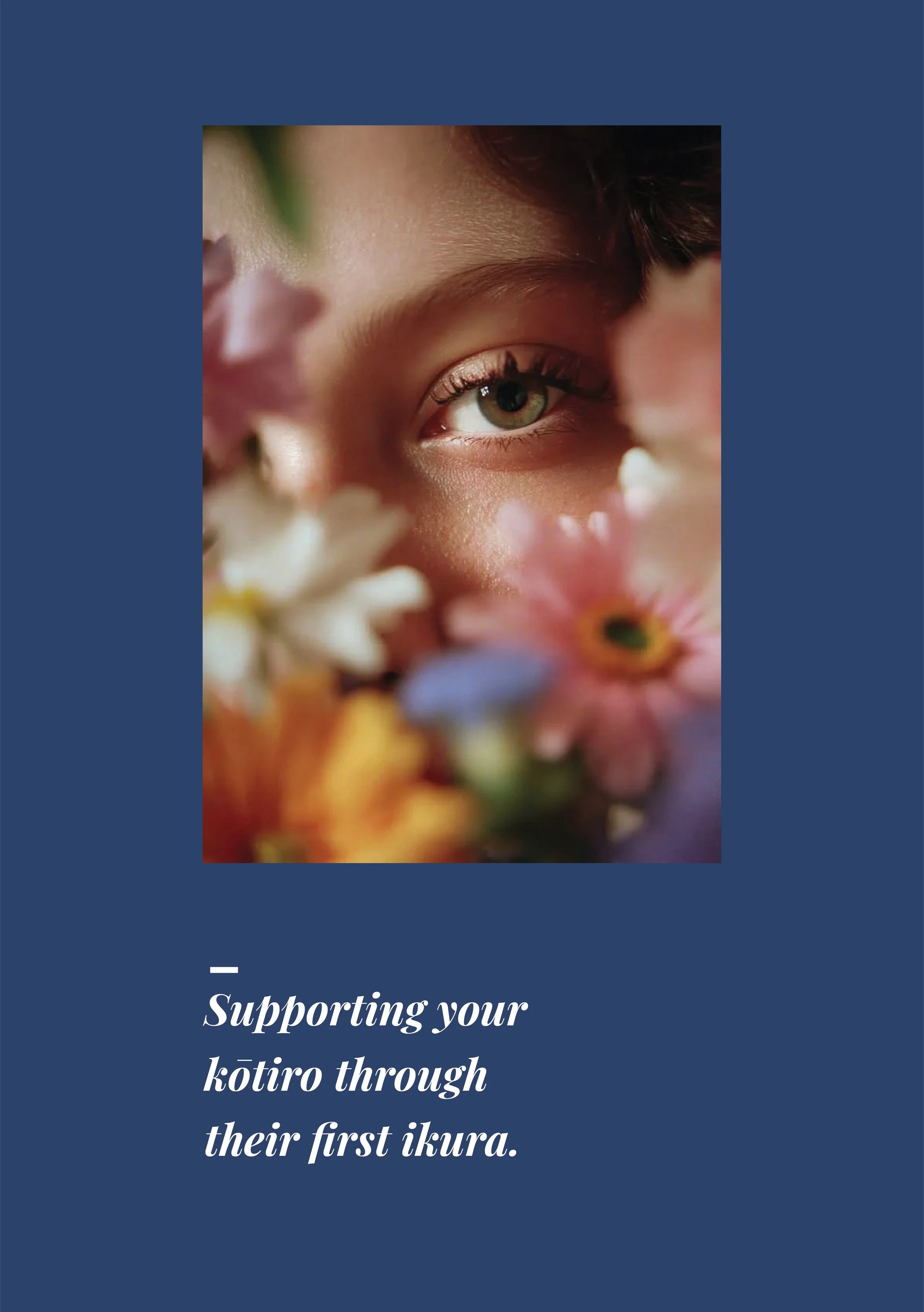
For kōrtiro, the brand is bright, floral, open, warm and friendly. It’s the part that says this is for you.
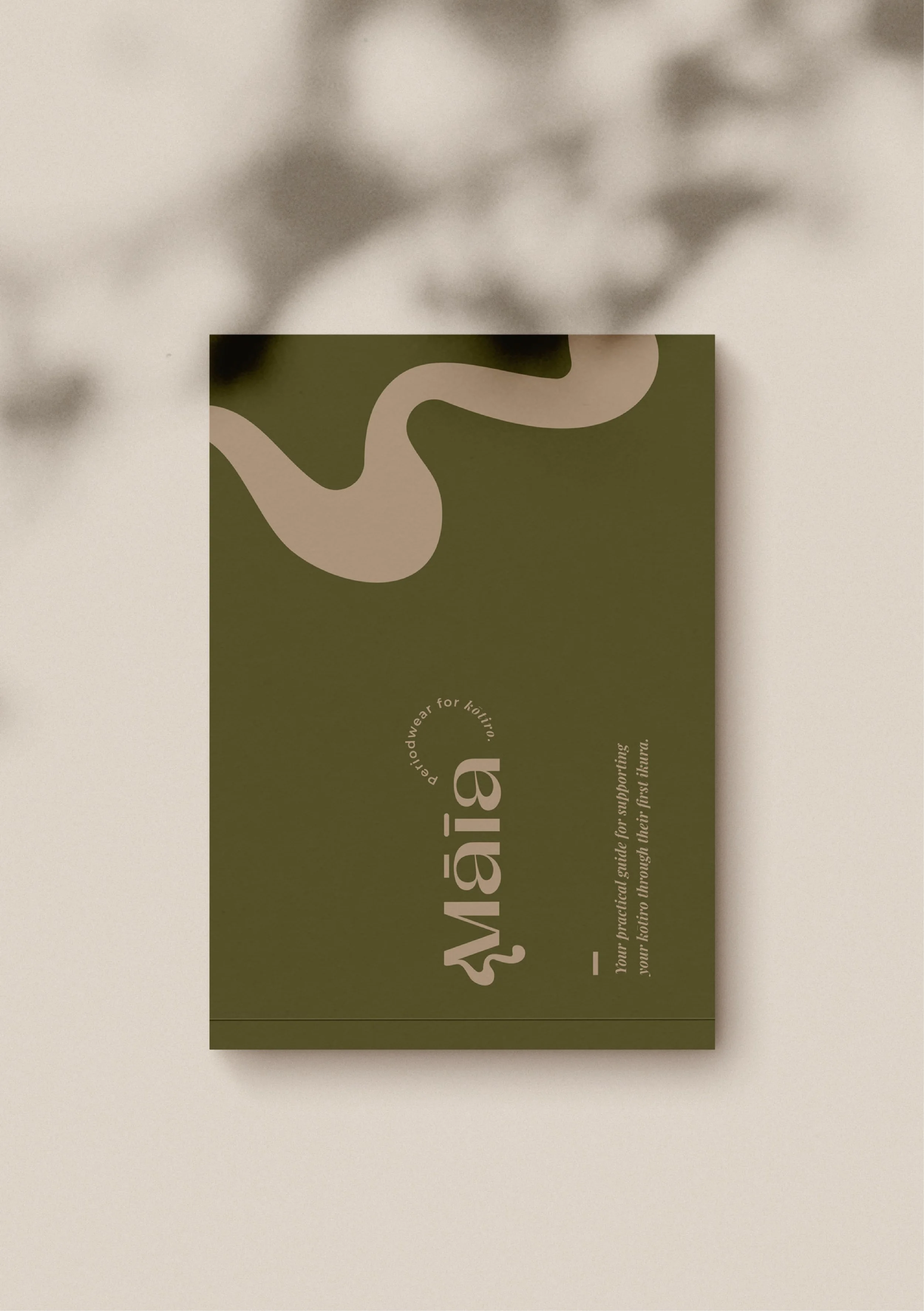
For caregivers, the education side shifts into something quieter: more earthy, more grounded, more authentic. It builds trust before a single word is read.
The two registers share one system. They read as two sides of the same conversation, not two brands stitched together.
The Transformation
A Dual-Voice Palette and Visual Language
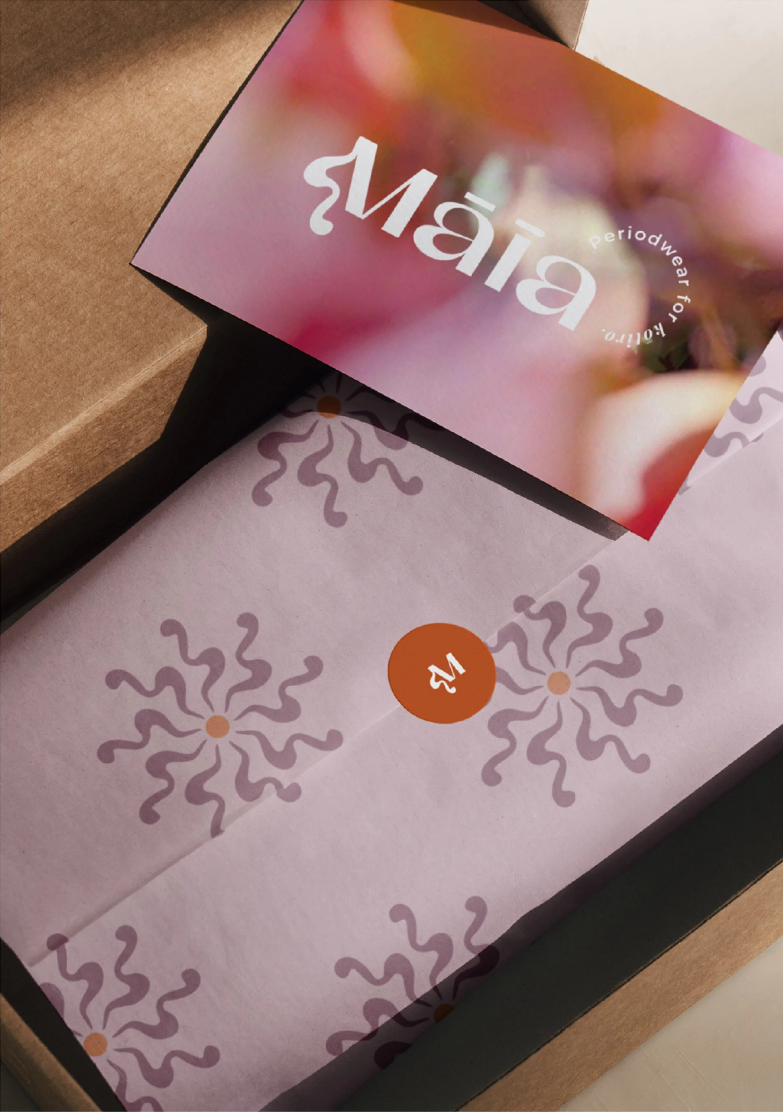
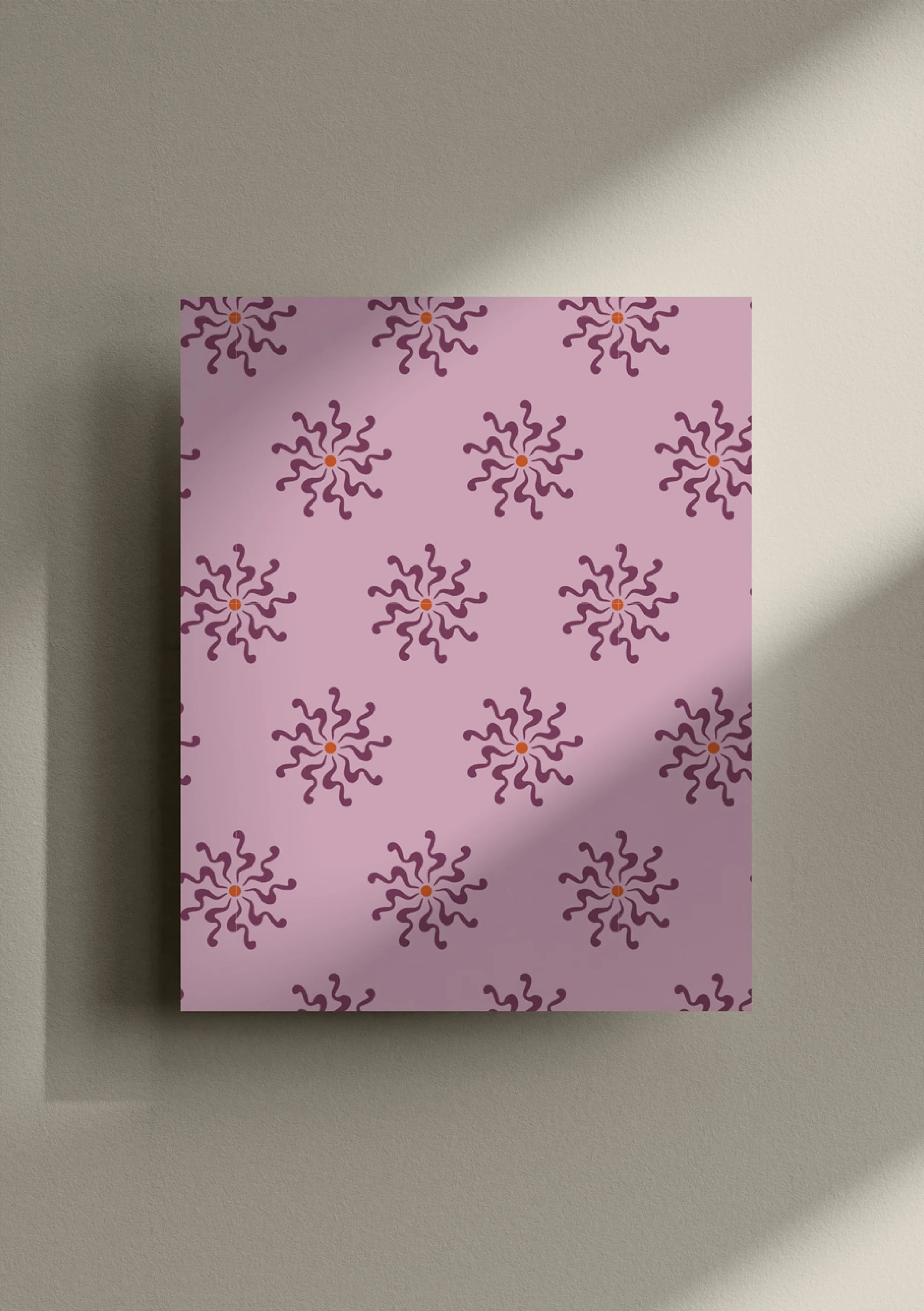
Brighter, floral, feminine tones lead on the girl-facing side. Earthier, softer tones carry the caregiver-facing education. Together they work as a single system, so the audience signal is felt rather than announced.
A Wordmark Built on Contrast
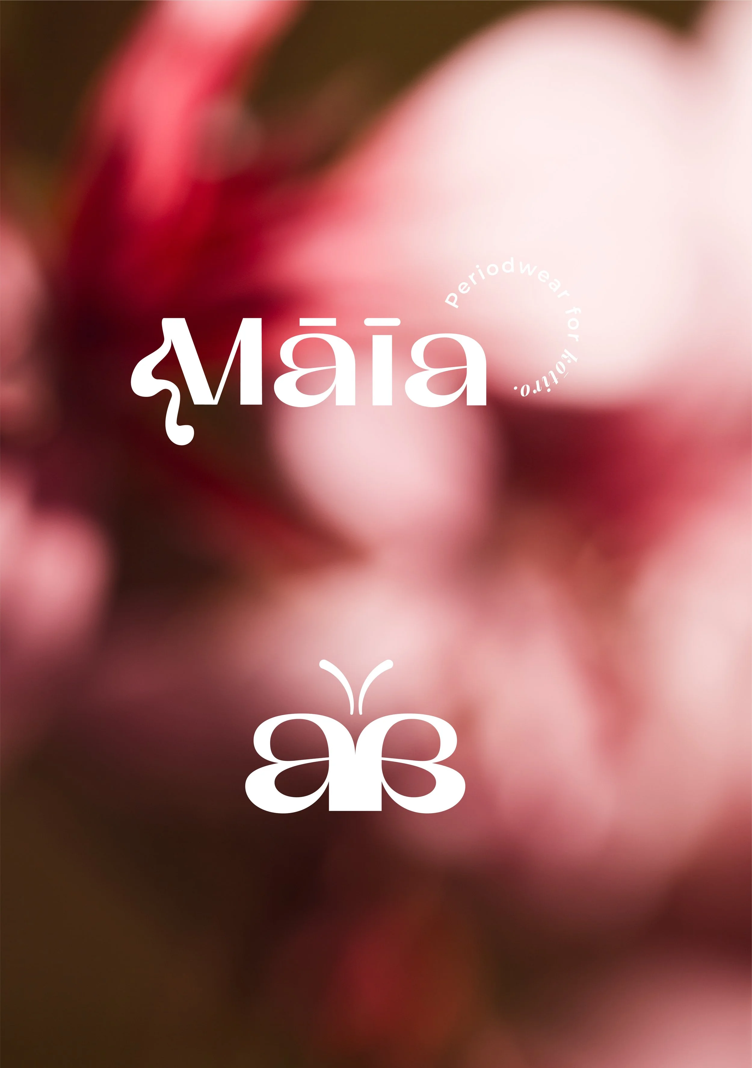
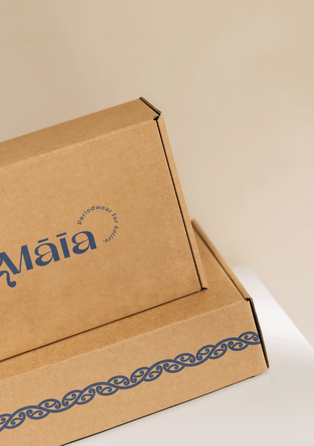
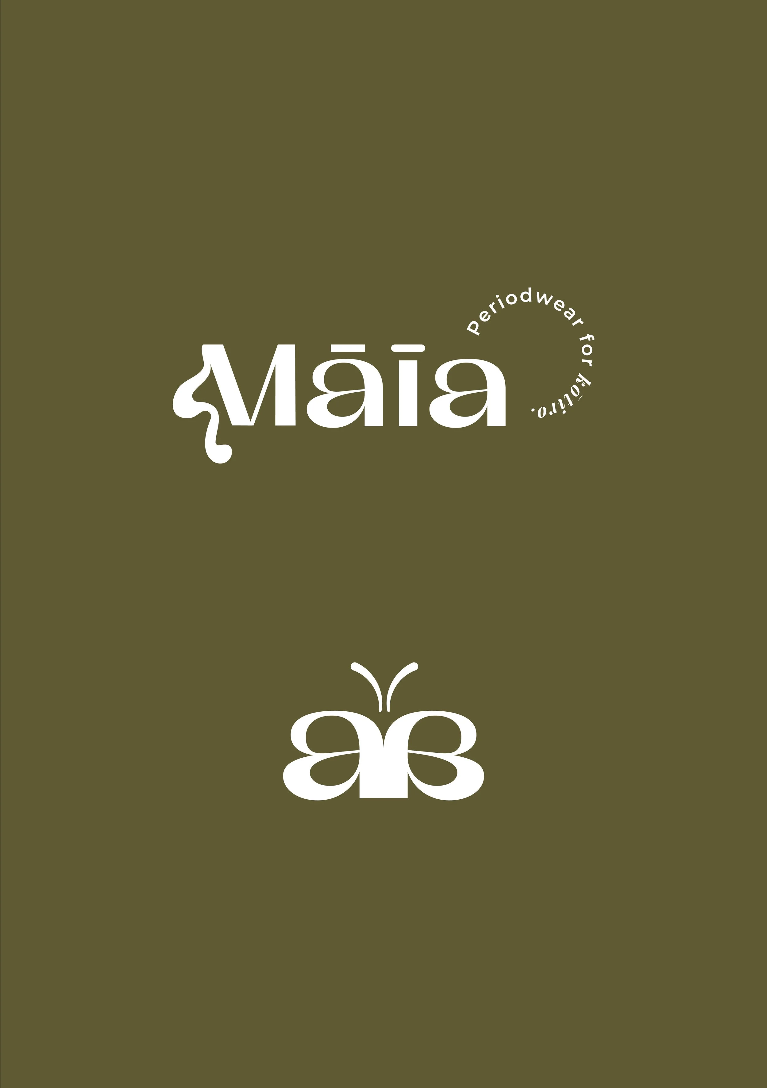
Small details in the logotype hold the two audiences together. The rounded and the hard-edged sit side by side in the dot of the i and the macron over the ā, soft against sharp, playful against grounded. It’s a tiny detail that carries the whole idea of the brand.
The Swish
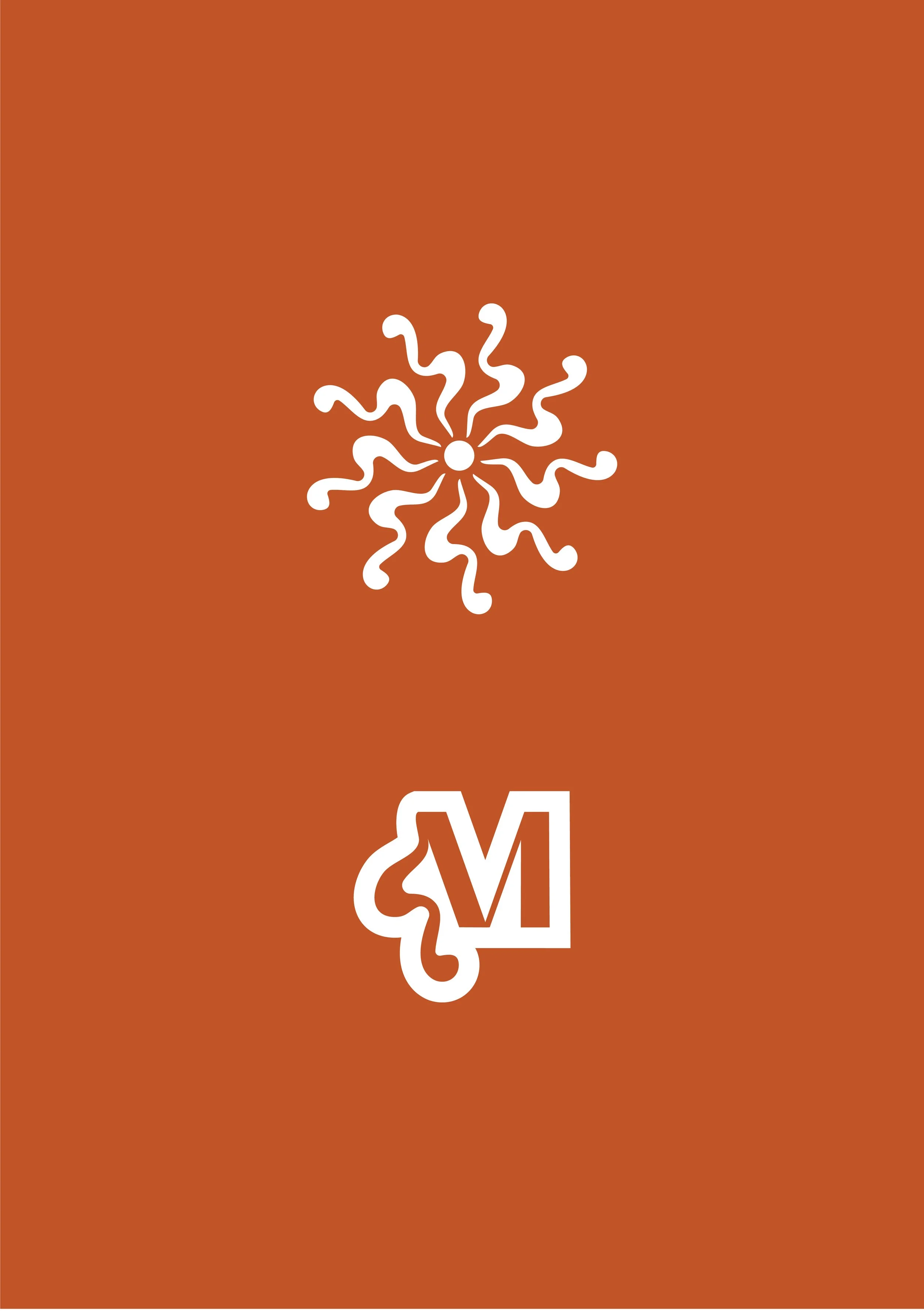
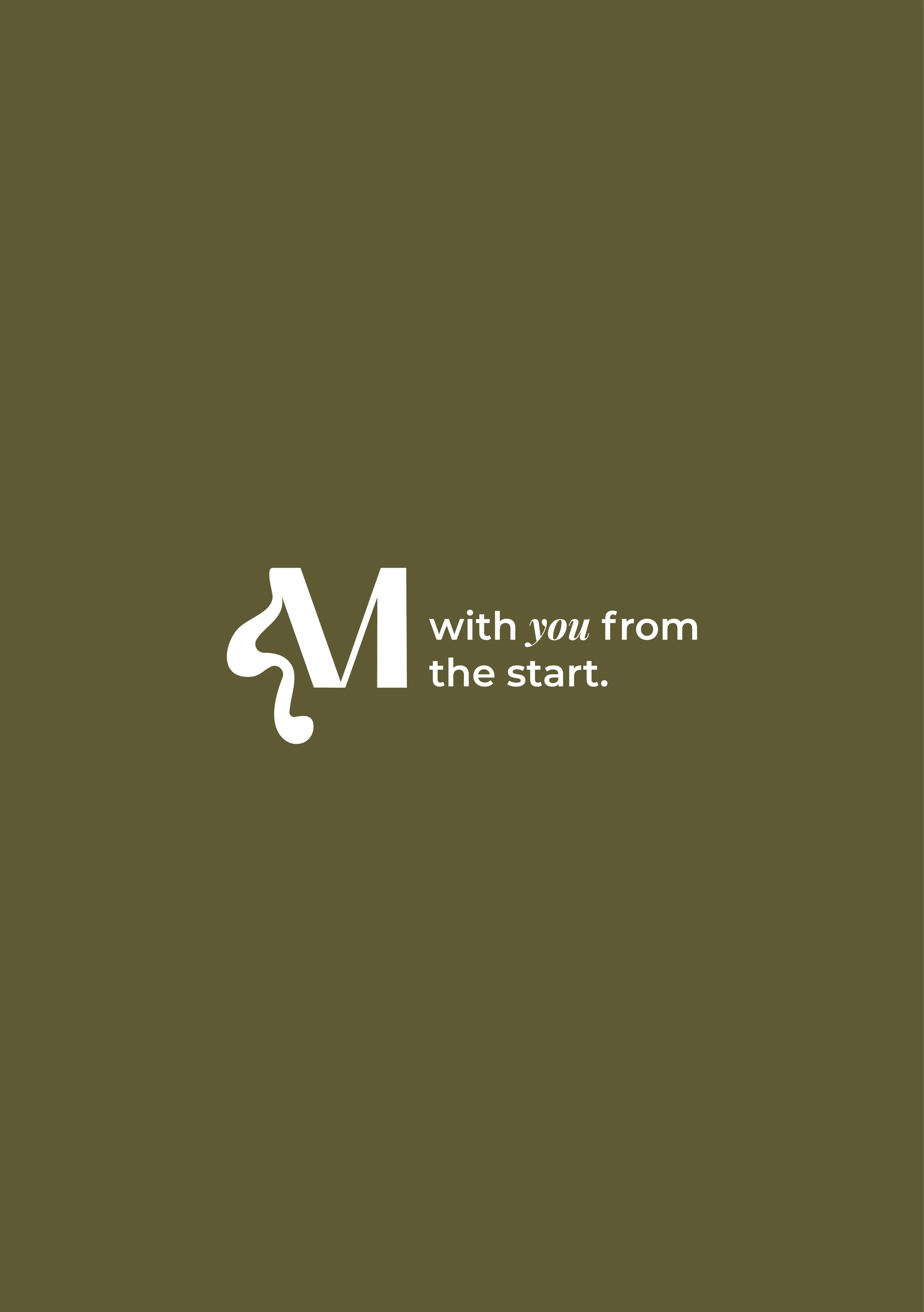
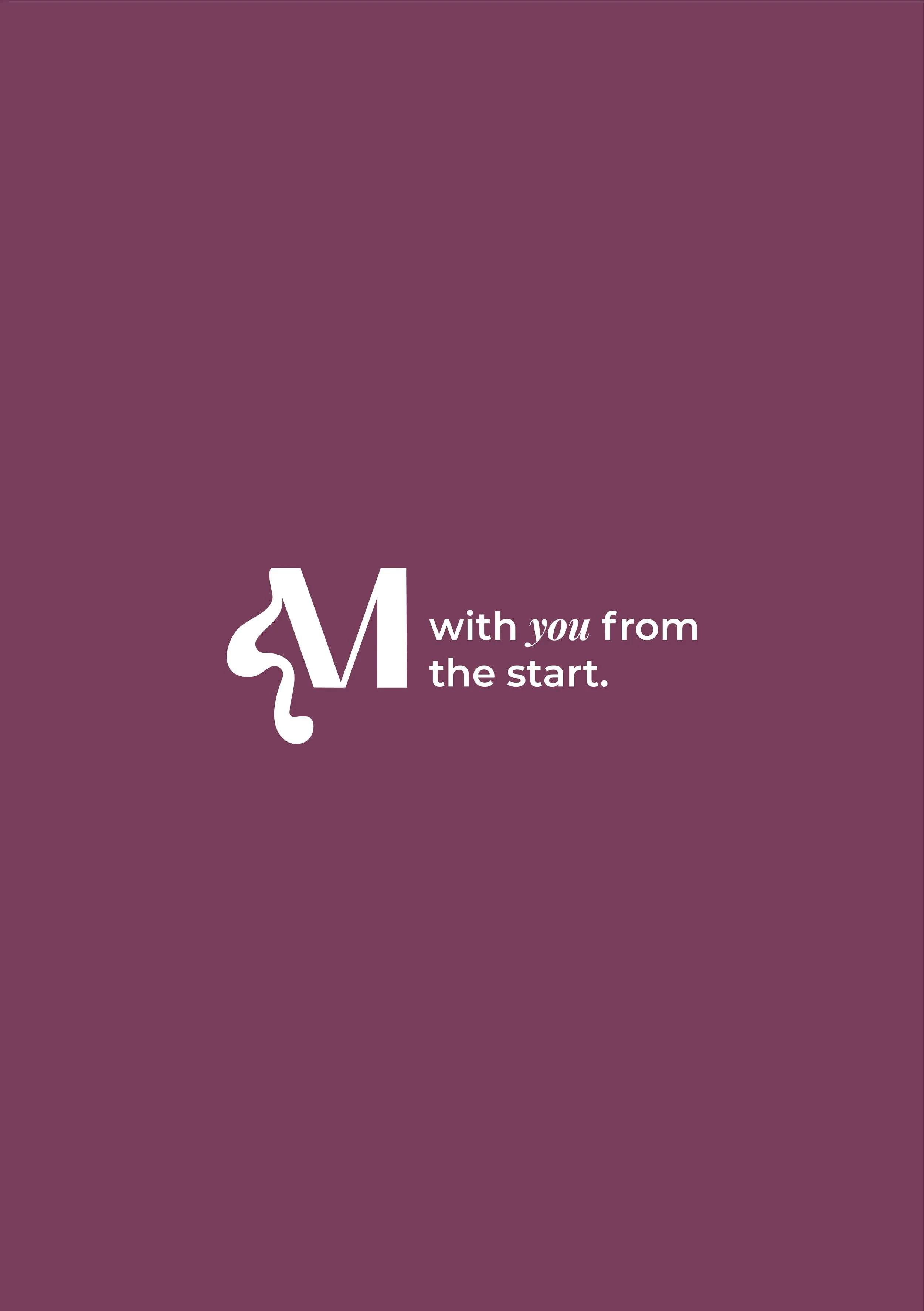
The sweeping form of the M signals flow: movement, nature, water, blood. It speaks honestly about what the product is for without ever being icky, which is a harder line to walk than it sounds.
Te Reo Māori at the Core
The name itself, Māia, means brave and confident. It sets the tone for everything built on top of it: a brand that meets girls with courage instead of embarrassment.
Smarter Production
The brand also had to work in the real world, and on a startup budget.
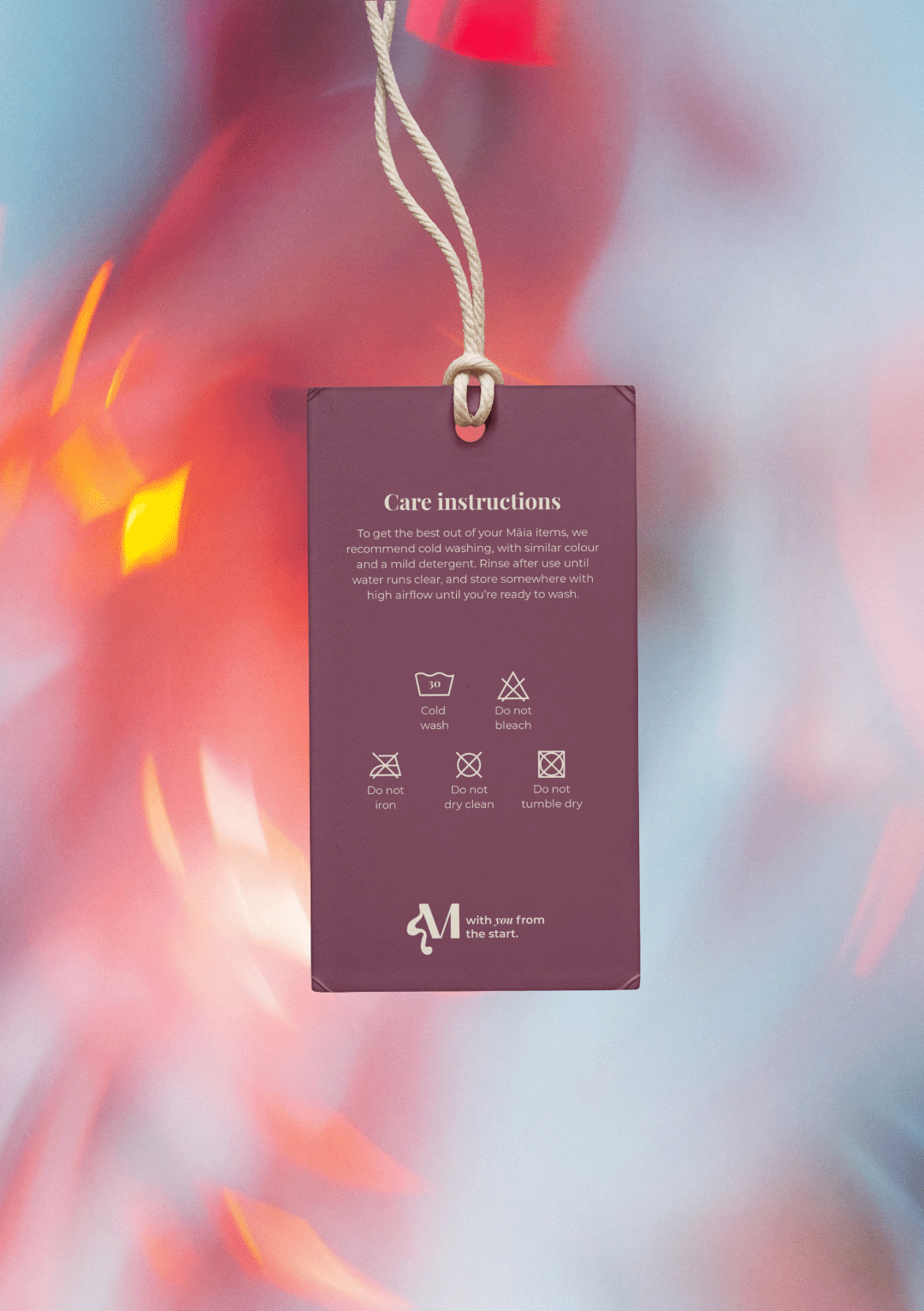
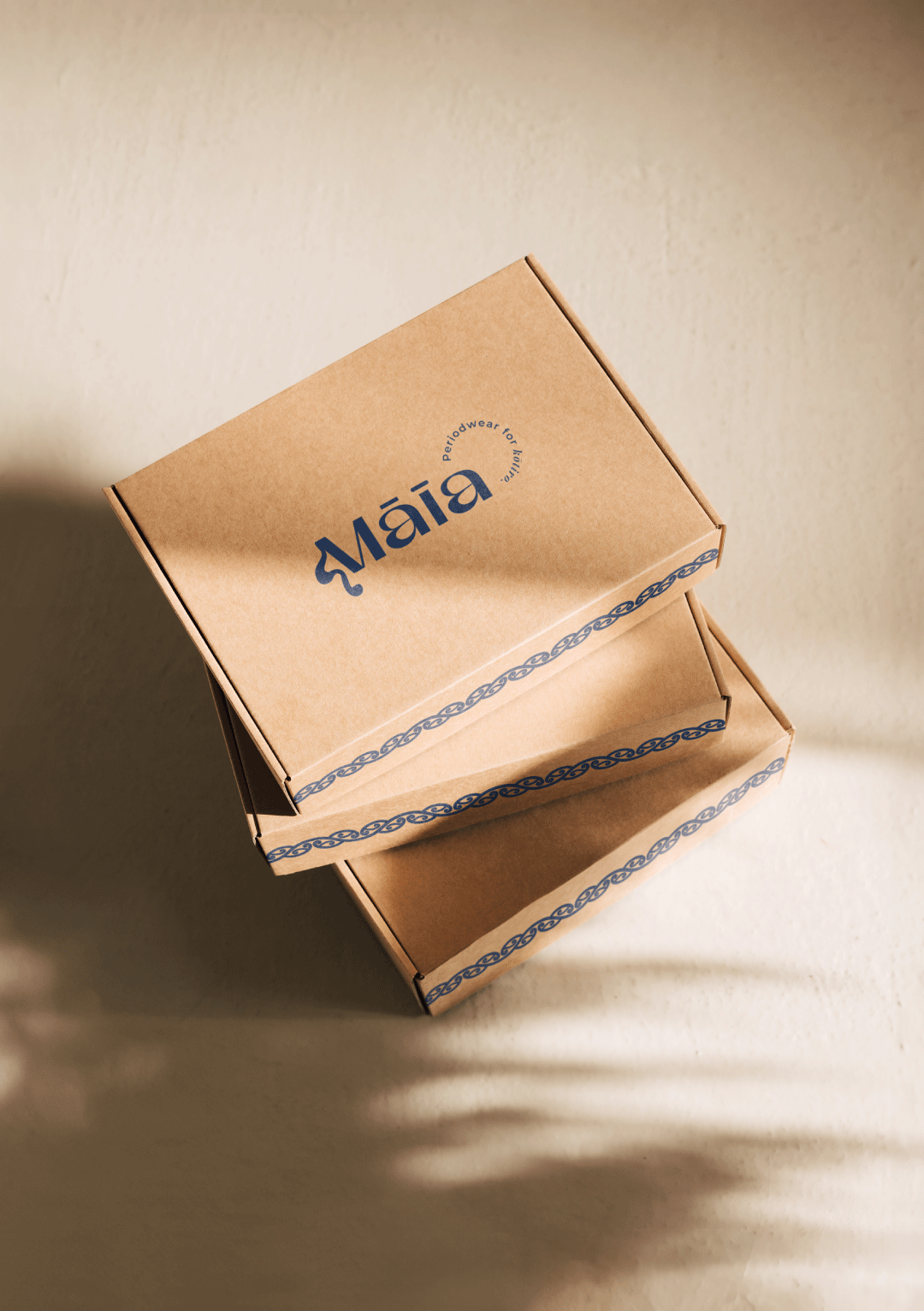
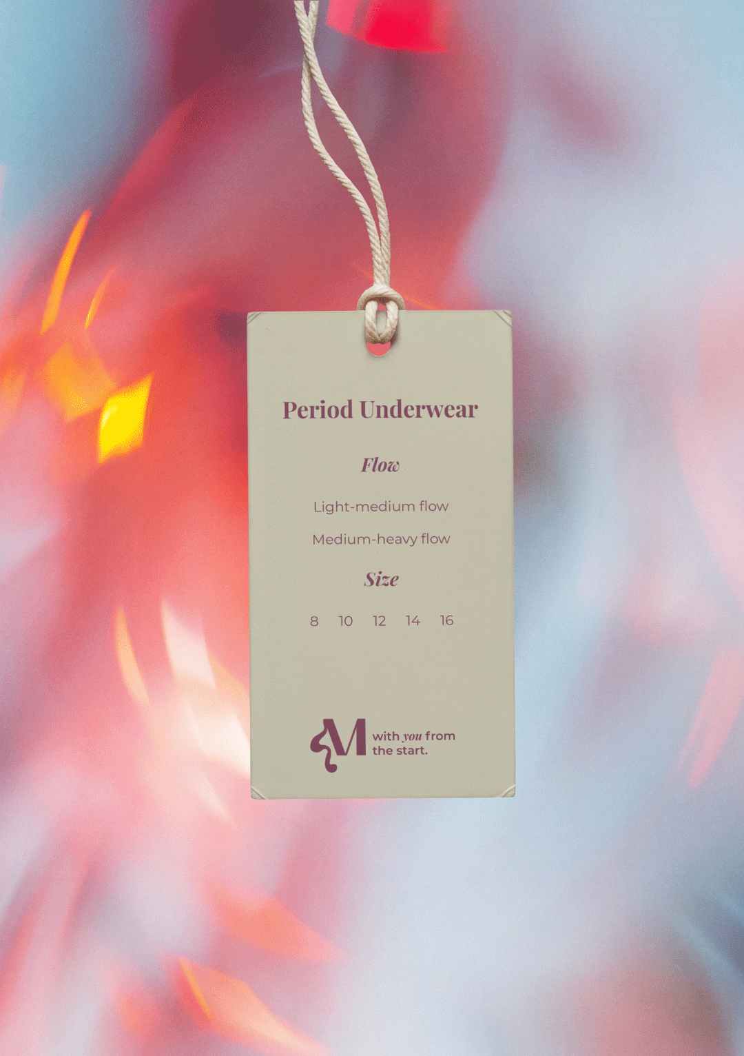
Māia’s range is seven products across sizes 8 to 16. The original swing tag plan needed a separate hand-applied sticker for every product and size combination. That’s a lot of SKUs, a lot of printing and a lot of hands.
The system was rebuilt down to three labels with no printed stickers. Production costs dropped, handling got simpler, and the brand looked cleaner for it.
Key Benefits
One Brand, Two Audiences
Girls and caregivers each feel spoken to, without the brand splitting in half.
Trust Before a Word Is Read
The grounded, earthy education side helps caregivers feel safe engaging with a topic that can feel awkward.
A Distinct Place in the Market
Honest, warm and relational, rather than clinical or loud. Māia stands apart from both.
Built to Be Produced
A simplified label system reduces cost and effort, so the brand can grow without the packaging holding it back.